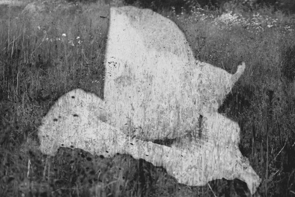
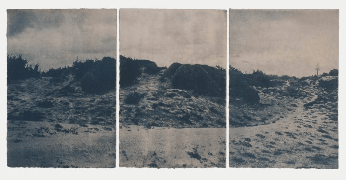
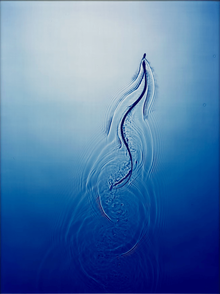
This is an overlay image, using two photographs from the recent shoot on the Severn Way. I followed online instructions to do this in photoshop and made various adjustments to better reveal the large poppyhead over the primary scene of the wild flowers and plants. The intention to use black and white was to give a suggestion of memory. In being more abstract, it is perhaps more in line with how our memories work, as visions of the past, which are not always accurate or entirely reliable.
I would like to try an overlay image which uses a clear night sky and a lake or river. This may come after this module because of time available.
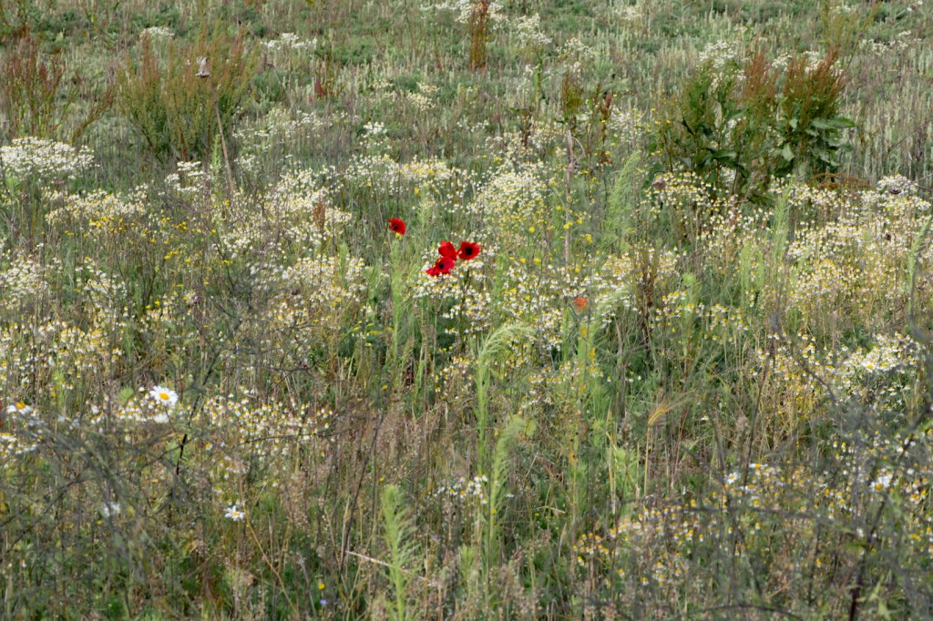
9am, Sunshine and occasionally overcast, rain about. 7 June 2025
52.11250° N, 2.22830° W.
07.06.25 / 9am
Sunny with occasional showers
Nikon D850 with 105 prime lens (handheld)
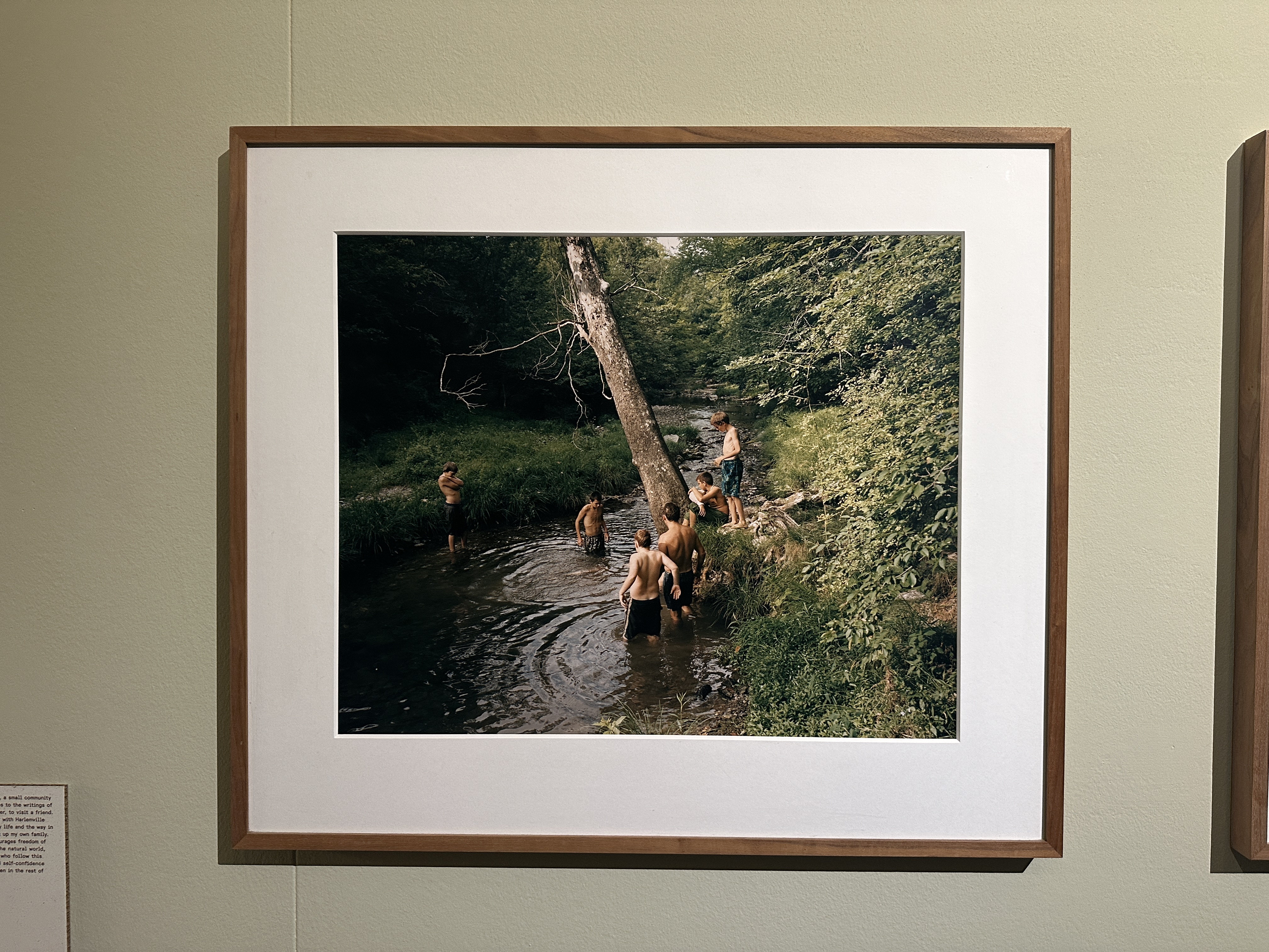
I headed out on a shoot with my digital camera with the intention of practicing a few skills, on the back of my research into Anna Cabrera and Angel Albarrán. Considering their approach, I wanted to try using movement as well as deliberately spending more time waiting and observing, as I attempt to really challenge my understanding of what I am trying to convey. Also, the work of Jitka Hanzlova is in my mind here as I try to think about the ‘waiting’ aspect of a photograph; all to often I am impatient, typically thinking about what I need to do next and how much time I have.
Selected Images
I’ve chosen a few images below from the shoot, with which I did some basic post production in photoshop.
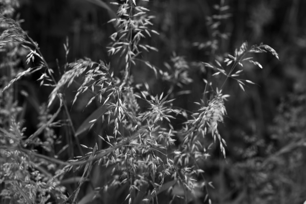
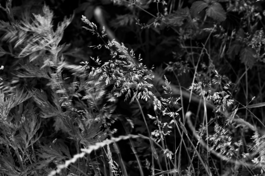
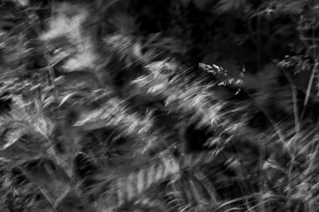
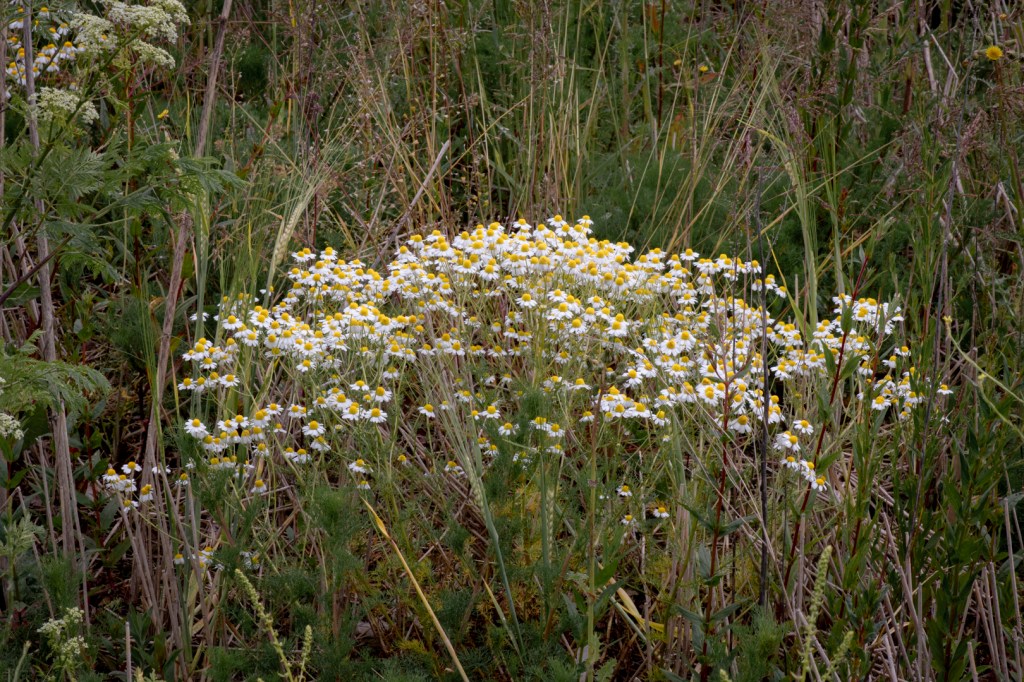
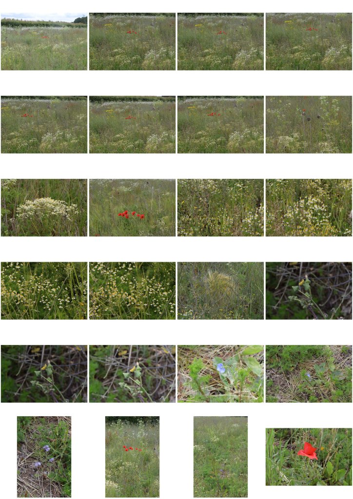
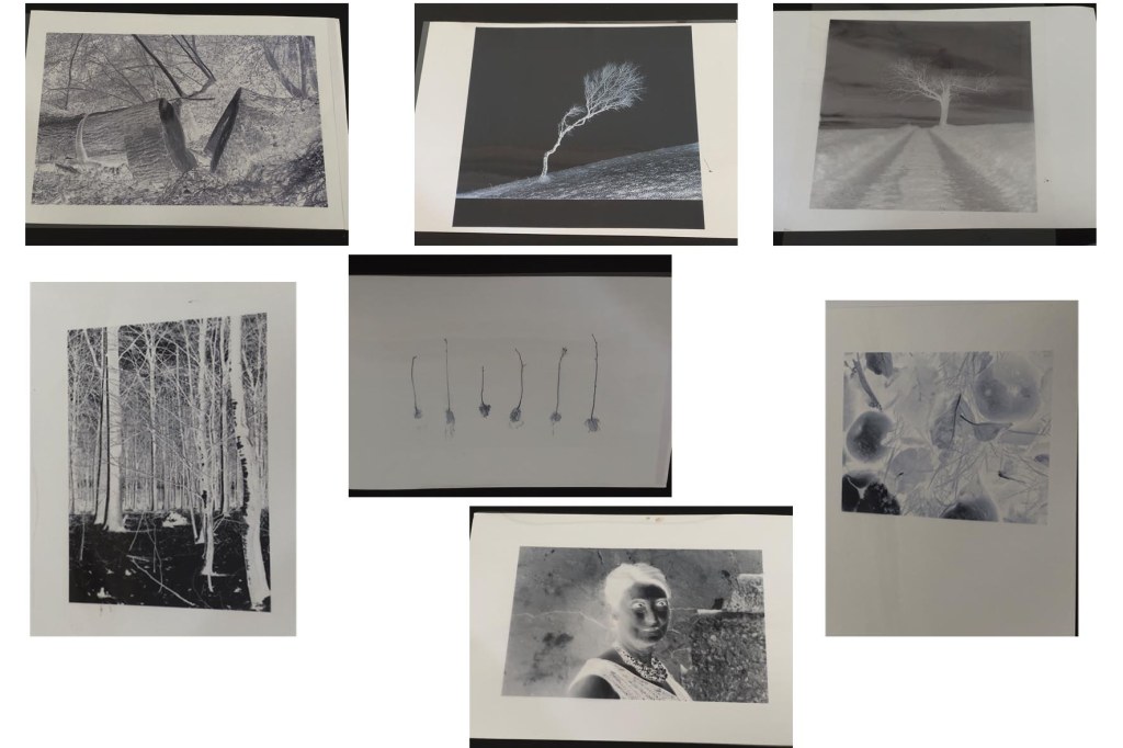
These images of grasses appear better in black and white. I used a slow shutter on the last one as you can see, I like the result as it appears as dreamlike and ephemeral. Themes surrounding impermanence and / or change interests me at the moment and I am exploring this as a central theme for my FMP. There is some evidence of movement in the first two images, not as clearly but the wind was more still at that moment. I think that the three together, show elements of movement, chaos and transition. The original colour versions are in the contact sheets at the bottom of this post.
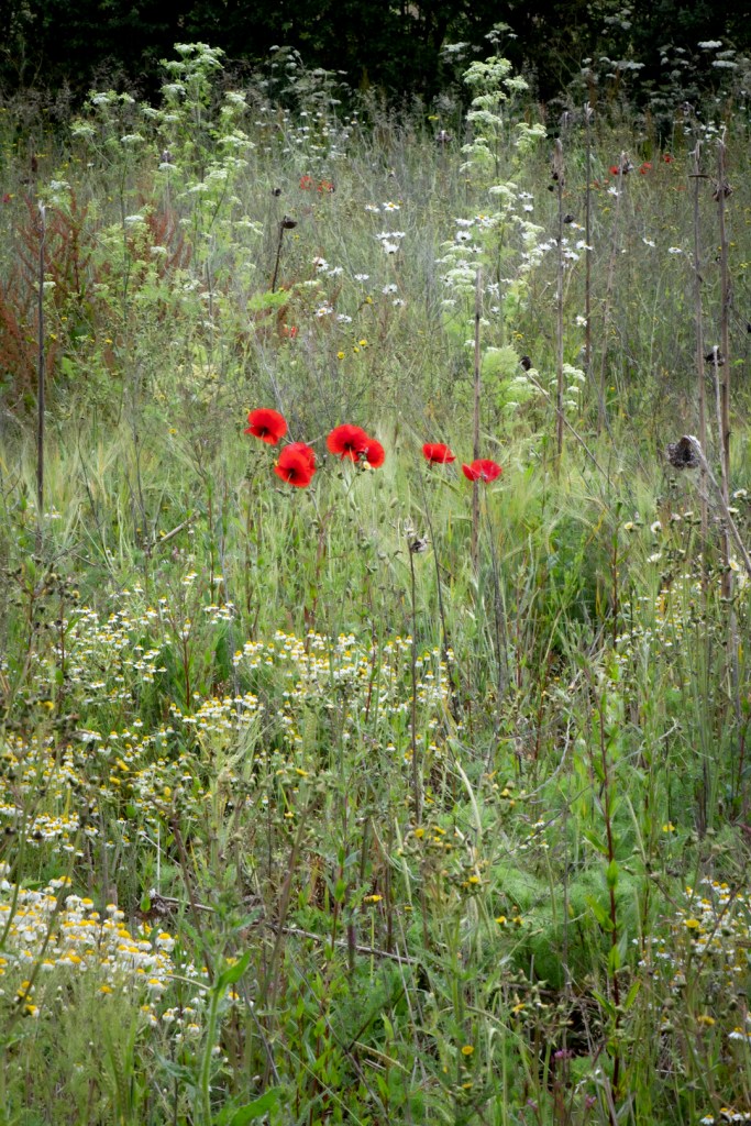
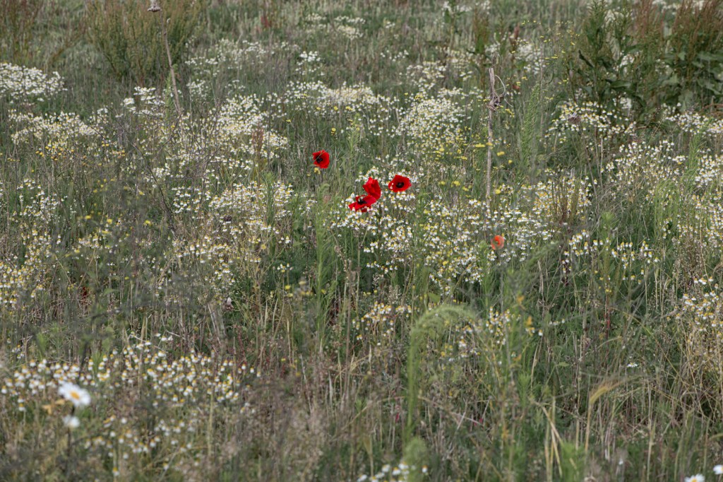
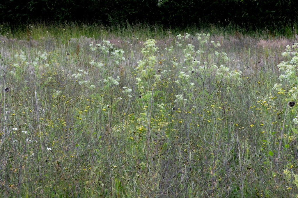
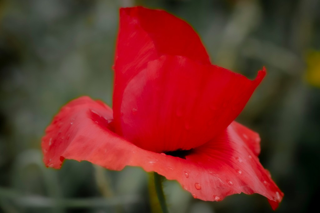
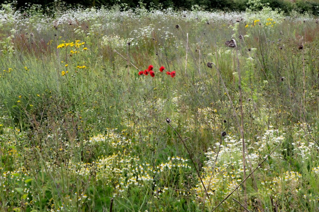
This next set of photographs were taken as I progressed on my walk, they are in two seperate areas of farmland, but both have seemingly diverse plant growth. I took a long time exploring the chaos of these spaces, the complexity of the plants, all common to our countryside, were playing host to a vast number of insects. I wanted to show these areas in all their chaos, with the vibrancy and texture that I observed. I played around with some of the post production features in lightroom to try and show this. I find my camera over exposes in these circumstances so I need to underexpose otherwise the details are washed out. I particularly like the small clusters of poppys and the long decayed sunflower heads, which I photographed back in winter, in their frozen landscape. Their resilience is symbolic.
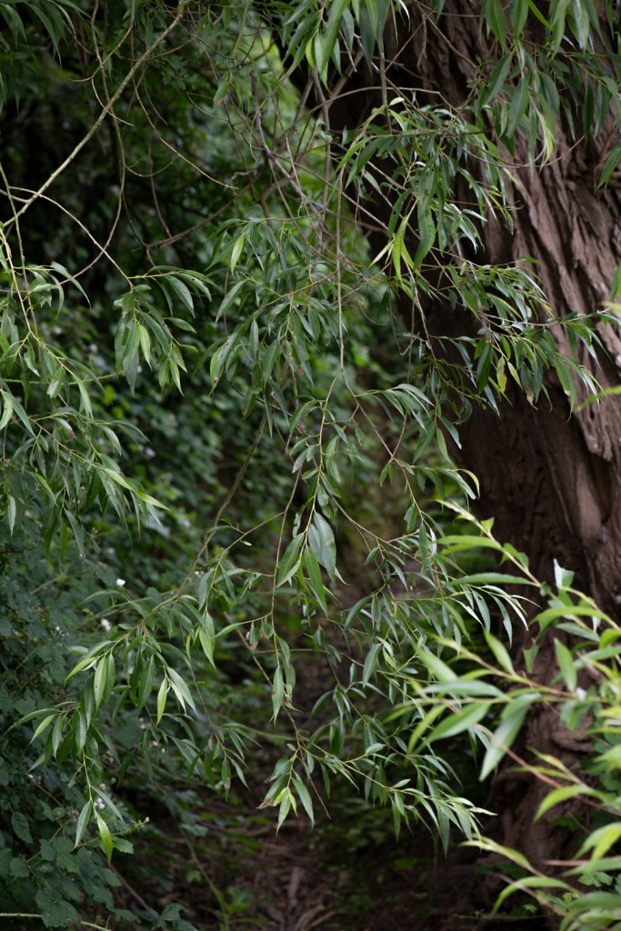
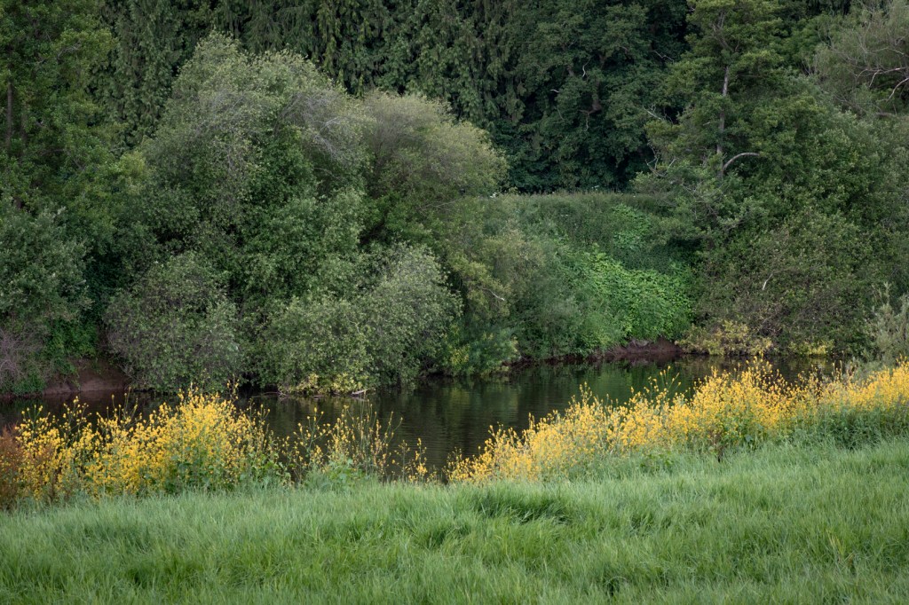
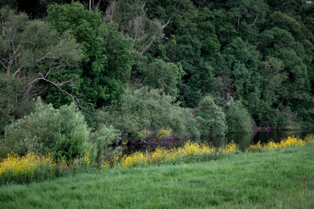
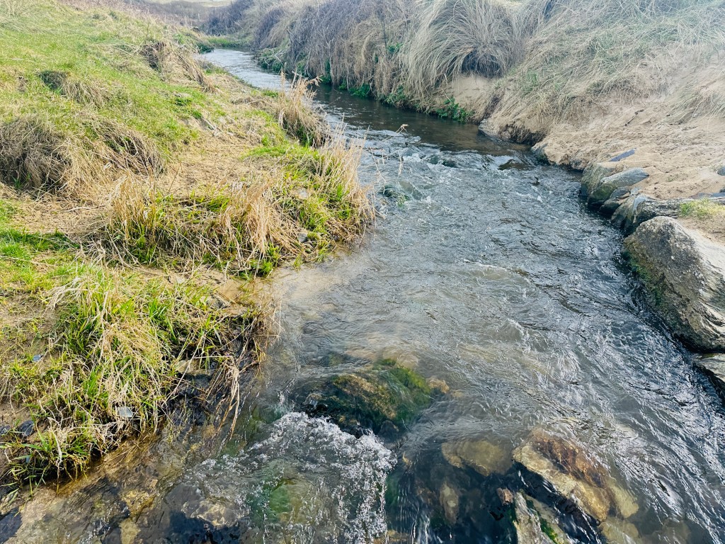
As the walk progresses, I start to follow the track down to the river, crossing a dried out stream with a willow tree overhanging . The River Severn here seems to be quite a fast flowing stretch, set against the backdrop of the malverns and a steep bank of trees behind.
The foliage is very dense by now, I love how the yellow flowers mark out the edge of the river and naturally breaks up the scene. Shooting in bright daylight isn’t ideal of course but I have to make the best of the time I have available at the moment. When I make my images for the FMP, I will need to prioritise time a little better to achieve the result I am after. I think at either end of the day, the photographs in all cases would be richer, I could also shoot at dusk and use some flash to see what impact that might have.
Susan Derges’ work with water at night, exposing photosensitive paper in water, then using a very brief flashlight to expose the image, are well known. I am interested in how I could utilise some of her methods to expand my own practice, especially given some of the similarities with my own themes. One of the considerations for my FMP is based on a family owned lake, which has played a significant role in my children’s and their friends childhood adventures. I am wondering if creating a multi disciplined body of work could be viable, for which this could be a part. Having researched her process, I am keen to see how the lake might be used in this way. I am thinking of some of the overhanging willow that might cast a shadow on the paper as I fire a flash. I will have to try this after the module once I have picked up some unfogged paper.
“Within seeming chaos, Derges conveys a sense of wonder at the underlying orderliness. She examines the threshold between two interconnected worlds: an internal, imaginative or contemplative space and the external, dynamic, magical world of nature”(vam.ac.uk)
She talks about her use of water being a metaphor for transformation.. this isn’t the first time I’ve heard someone talk about water in this way. Although Derges is referring to her practice and results, Amy Jane Beer, author of ‘The Flow’ discusses this as she felt its transformative power following her revisiting the place on the river where her close friend died, having been caught in the rapids.
Her question of ‘what underlies the invisible?’ seems to be an ongoing enquiry throughout her work.
In the film above Derges discusses her work with the Exmoor Society, talking them through the different images she has made from the river Bovey through to a waterfall and finally the sea. It is useful to hear her discuss differences depending on moon phases as I had wondered how this might impact the results. She mentions a type of paper that she used ‘Ilford Chrome’ as producing good results however it looks as though that may not be available anymore, I need to find alternatives, if I decide to push things further with this I could try that out. I have a pack of A5 ilford paper that I can use for this, during initial experiments. She doesn’t give much away regarding exposure time – in effect she has a multiple exposure because she initially uses ambient light (from nearby town or from the moon) then follows by finishing the exposure by using a flashlight. I am not clear on how / why this works as I would’ve assumed any ambient light would ruin the paper.
Tide Pool 26, Derges, S. 2014-2015
With the assistance of a marine biologist, Derges used a large saline solution filled tank in which to create a simulation of tidal surges for her series Tide Pools. This has given me the idea of experimenting with her methods from home. I could perhaps use my bath to experiment with.
Relative to my practice:
I am about halfway through a novel called ‘Rivers in the Sky’ by Elif Shafnak. It is a tale which covers many centuries, beginning in the Assyrian Empire and the reign of Ashurbanipal in 669bc, through to present day. Within the story, she subtly weaves the journey of a single drop of water as it travels through the centuries, reappearing as a raindrop, a tear, part of a river, the sea etc, as if to show how nothing us ever gone, it is always in a process of change (I’ve not finished the book so I don’t know how it will finish up!) essentially, it follows the theory that water retains memories from all the forms it has ever taken. In Derges work, she talks about nothing remaining in a state of being or dissolution out of being, it is always on the move. The common theme throughout my work is that nothing stays the same and that nothing is fully gone, our memories remain in some material way, within the environment and ourselves, as dust, water etc. It is this that I hope to hone in on and amplify. Especially when I think of the places where I’ve spent the most time and feel a physical ‘pull’ towards.
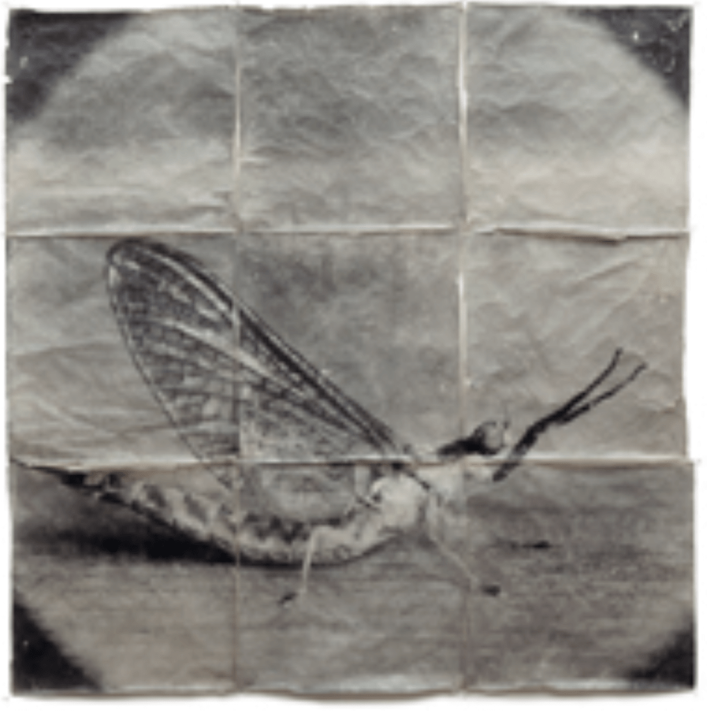
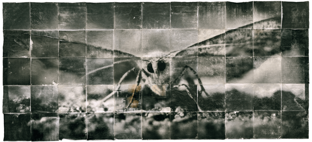
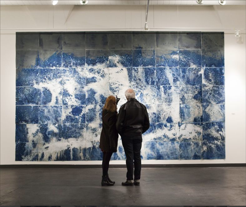
Two of Starns pieces of work are shown below. Their unconventional use of materials and styles is a goldmine of research into what is creatively possible. I have selected the works below, from their series ‘Attracted to Light’ because of the scale and complexity of it and their process in creating it. By using large format cameras and macro lenses, they can scale up their images and then print multiple panels to create their collage effect. They have incorporated blur, grain and motion in the images, qualities which together convey aspects of fragility and chaos. To further support this, often their pieces have physical marks, creases and rips intentionally left on them, as part of the overall aesthetic. The Starn’s preference for imperfection over precision conveys energy and emotion, with the moth as a symbolic future of longing, transformation and mortality.
Their themes are complex and intricate, it is interesting to look at how different approaches can convey a multifaceted message. I would love to see their work in person, this really makes me think about the work as an object as whilst I can see it on a computer screen, the many layers of complexity within it, necessitate it needing to be seen up close.
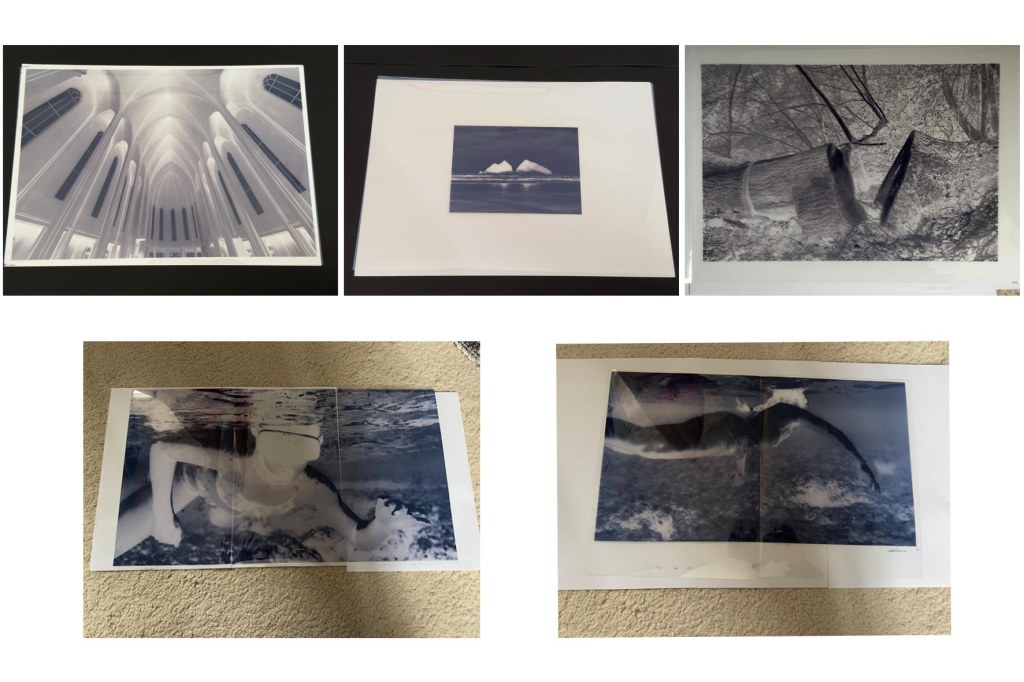
I like the idea of being able to create a large piece of work without needing a huge space to print in, which makes this approach more accessible, due to printing in small sections. I used an online tutorial and split an image into 9 A4 sheets, using a slice tool before printing and piecing together. I printed straight on to plain copier paper as this was purely to see how I might be able to align the sheets and test the impact of a larger scale piece. I chose a photograph I had taken several years ago when I visited a large church in Reykjavik, Iceland. I remember thinking how pristine and minimalist it was and that the stonework was so consistently smooth. The scale of the building and the lines of the vaulted ceiling lent itself well to this test. Although I probably won’t progress this image further, it was useful to use for this purpose; there are so many lines and curves to align!
Looking into the Starns processes and influences has made me think about what is possible beyond the conventional and consider what opportunities there might be within my own practice to dig a little deeper and take a few risks with the work. I like the idea of a landscape scene being at a large scale in a collage arrangement, also using imperfection to create something more akin to an object than a picture.
Sources (as well as general google search and social media sites) :
I came accross Marco Rappacini on instagram several years ago and I have admired his work ever since. His level of mastery in cyanotype is awe inspiring.
Examples of his work:
When I first encountered Marco Rappacini’s work, I had a sense of excitement, imagining the possibilities for exhibiting my own pieces. Often, when I view the works of other practitioners, I feel their level of achievement is beyond my reach. However, Rappacini’s prints, while exquisitely refined and beautifully presented, feel attainable in a way. There’s a clear consistency in his work, and it’s evident that he invests a great deal of time and dedication into each piece, which makes his craftsmanship both inspiring and approachable.
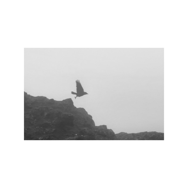
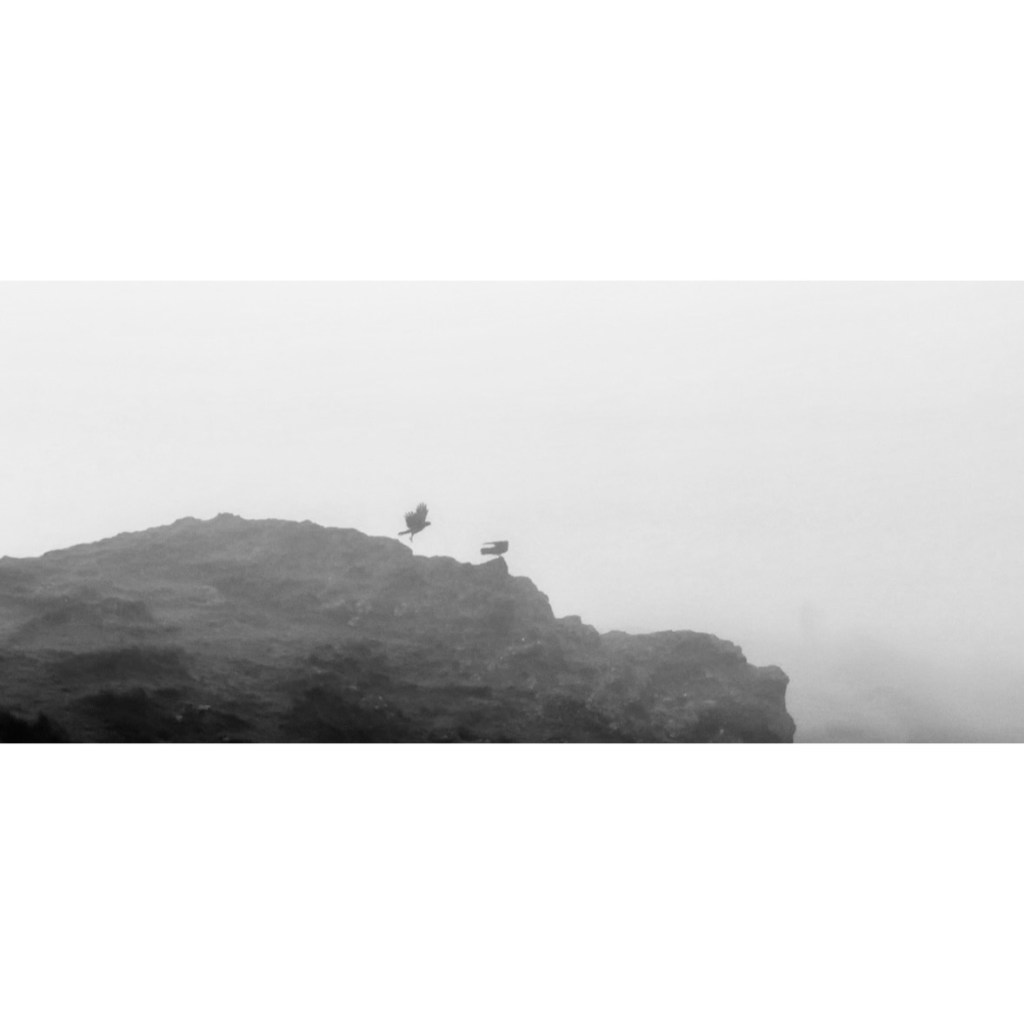
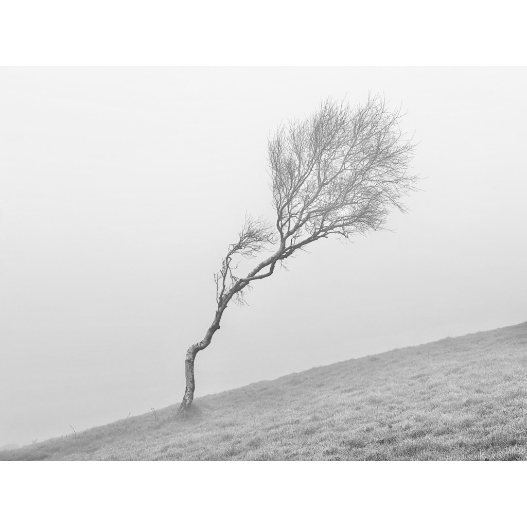
I realise I am quite wedded to this idea of diptych and triptych pieces. I think this is where it stems from. I know Rappacini also uses a toning technique in his work to enhance his subjects. I took a few photographs walking on the Malverns on a very foggy day, it was only later I realised that this was influenced by his work.
These are the images I took on that day. I plan to use the image of the tree in some of my experiments later on.
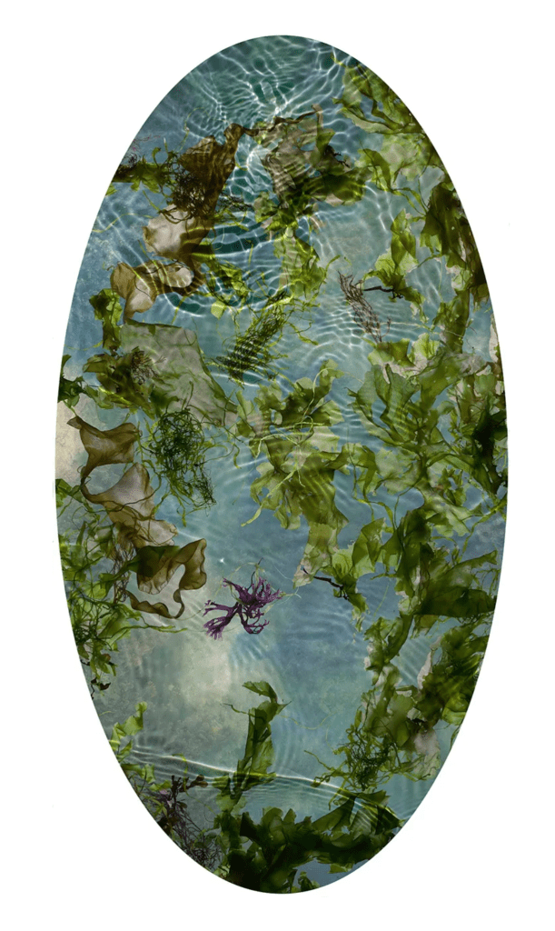
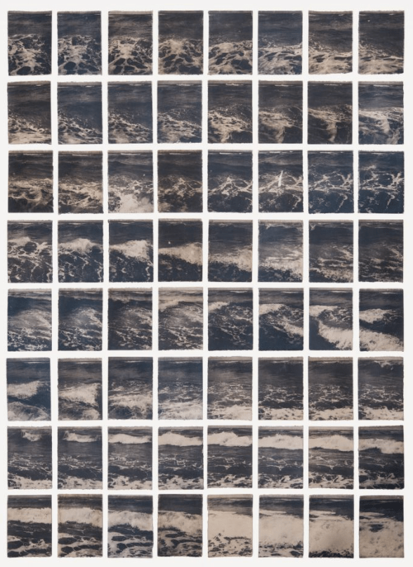
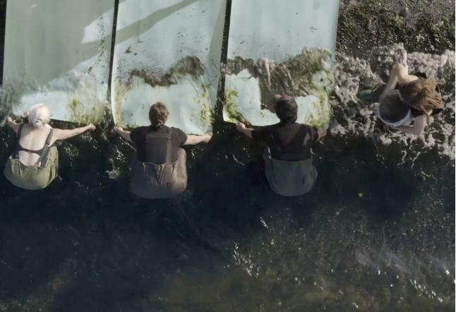
This body of work is the result of Riepenhoffs interaction with the sea. She typically creates very large cyanotypes, on location and uses the sea shore to form a print.
Having seen some footage of her process I can see that this often requires several participants, especially for the tiled piece (below) where many sheets of paper are attached side by side to create one large canvas. This gives the effect of that particular work being an installation piece. To create this, she rolled the prepared sheet into a light tight tube and then along with her assistants, unrolled it and walked into the sea to hold it in place (more on this further down)
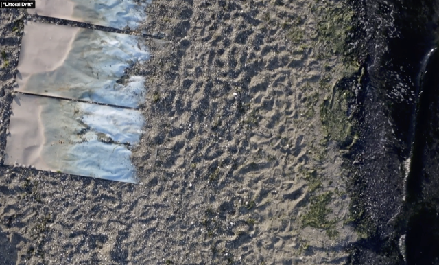
Once the water had washed over it, she & her team placed the paper on the shore and added further layers in the process by throwing sand, stones and other elements from the shore onto the work.
From watching a video in which she discusses her motivation for the work, its clear that she spends a tremendous amount of time refining and honing her skill. Relentless experimentation, working in ever changing conditions; the weather shifts constantly and the sea shore changes with every wave. This will have been time consuming and likely frustrating at times but this is what separates her work from something more simplistic. Its uniqueness is in its unpredictability and inconsistency.
I think that this is a practice in which one has to give up the idea of perfection or idealism. To collaborate with landscape and the elements that go with it, means surrendering to chance and accepting that there will be indeterminable factors, such as topography, wind, sunlight, tides etc. Waves are surely like thumbprints in that no two can be the same. I like the idea that working with natural surroundings means freeing one’s own need to control and predict. This could be a very freeing practice, connecting with the natural world and its rhythms. As Riepenhoff describes it, the sea is part of the subject and the process, a collaborator.
I’ve screen shot the above to show her work process, you can see in the top image how her team hold the sheets of coated paper and allow waves to wash over, collecting the sand and other minerals as they ebb and flow.
In the lower shot, I have shown the sheets semi buried in the sand, being exposed to the sun.
There is so much to consider here, re exposure, which sections will reveal detail, will any be washed away completely. How does she balance her process? Also, there is a time restricting factor here so she must have experimented a lot to determine best practice to achieve the results she is after. In relation to my own practice, I am fascinated with the idea of producing contact cyanotypes of this scale in such variable conditions. As with many practitioners I’ve looked at, I am mindful of how we rarely see their failures and it is easy to miss some of the fine tuning aspects of the process. With work such as Riepenhoffs, whilst she has to surrender to chance, there are clearly some disciplines that she adheres to and when I think about building my own working practices, it is useful to be reminded of this balance. For work of this scale, she has needed assistants to work side by side, creating a consistent, aligned piece. Therefore, although she is the artist, it has involved more than just her own skill, I personally view this as more collaborative.
A contemporary interpretation of photography’s earliest techniques
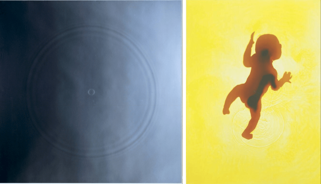
Left to right: ‘‘Ark, 1990′, photograph by Adam Fuss. “Invocation’ London, dye destruction print, by Adam Fuss, 1992.
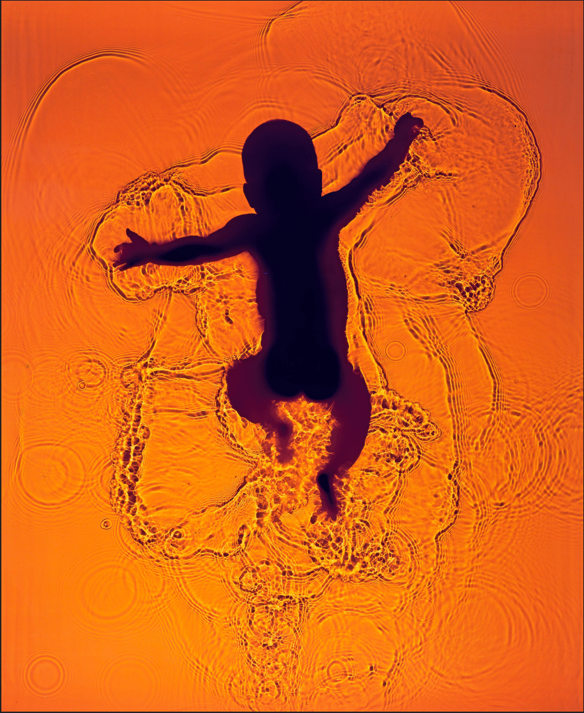
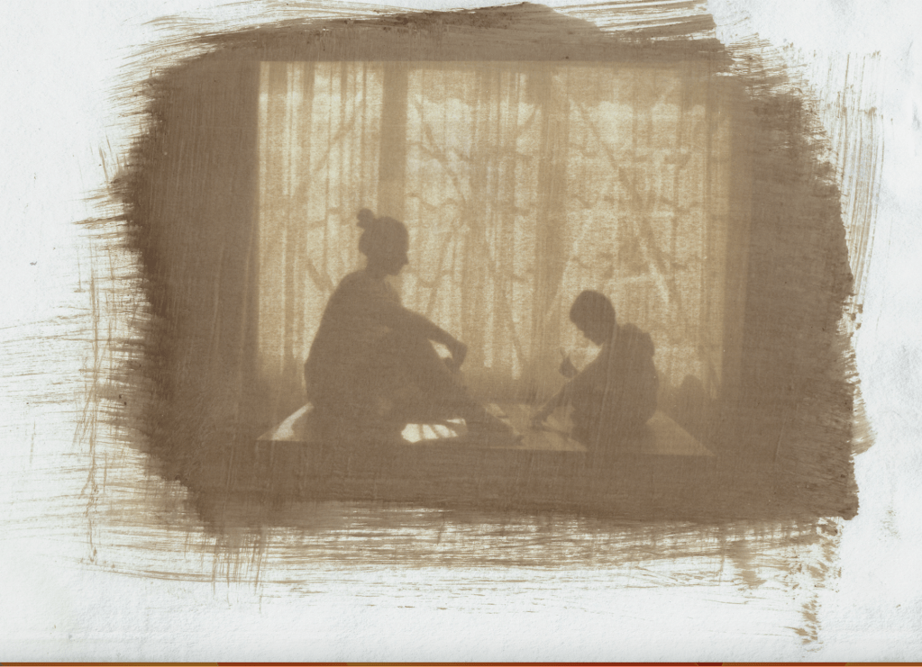
I first came across the work of Adam Fuss last year when I visited the Fragile Beauty exhibition at the V&A in London. This was a selection of Elton John and David Furnish’s collection of photography, shown from May 2024 to January this year. In 2011 they commissioned Fuss to create photograms of their infant son, Zachary and again in 2013 of their second son, Elijah. Presumably this was having seen his earlier work in a similar subject (see ‘Invocation’ above) Fuss created these by laying unexposed photographic paper at the bottom of shallow pool of warm water. David or Elton placed each of their sons in the water and Fuss activates a flashlight to capture the silhouette on the paper. It hasn’t gone unnoticed that the images appear to show the children as immortalised in a sort of baptism. Fuss always uses metaphor in his work and so this should be no surprise. The orange and yellow glow could represent bodily fluid and this could symbolise birth itself. There is a peacefulness to these images and it is their symbolism which I find very moving. Both John and Furnish are well known enthusiasts of photography and it is pleasing that they invest heavily in these works.
‘Zachry’ Adam Fuss. 2011.
Fuss himself talks about his exploration of a spiritual element to being alive (source: vam.ac.uk) and this is a common thread through his work. He also talks about how whilst a photogram might contain less ‘information’ than a standard photograph, it contains more intimacy and feeling. I suppose in the context of the photograph as object, he is arguably right, but I do think it also depends on the creators intentions for their work. I believe that intimacy and feeling can also be elevated in a standard image, for example, Sian Davey’s work which explores her own relationship with her young daughter and step daughter, however, I don’t think that is the context in which he is speaking.
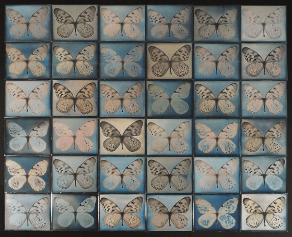
There is much discussion about the simplicity of Fuss’ work (subject matter, colours, materials) but they become complex when combined, fulfilling his inclination towards symbolism and metaphor. He manages to take the oldest, original processes and techniques and utilises them in unique ways to represent his subject in more contemporary times. My interest in Fuss’ work is in this ability to think beyond a literal representation. His work is highly experimental and this inevitably provokes curiosity and in depth discussion. The piece shown below is arguably the most well known of his daguerreotype images, highly reminiscent of a butterfly riker mount, used in natural history to display specimens, it is another example of his use of older techniques combined with other historical subjects.
Untitled, Adam Fuss. 2012
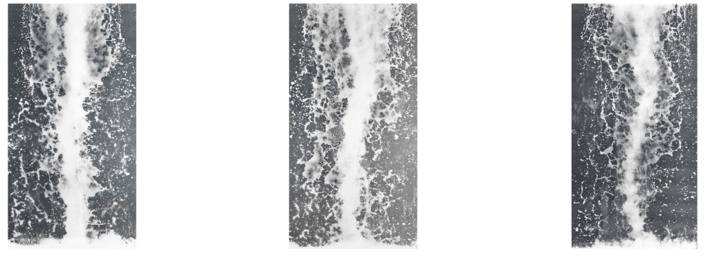
In his ongoing exploration of the spiritual qualities of the natural world, water features heavily in Fuss’ work. As well as the silhouettes created from infants briefly immersed as above (he has also placed himself in a large tray of water) he has created images of snakes rippling across a shallow pool, glycerin drops creating concentric circles and huge photograms of ‘waterfalls’ as shown below:
Logos, Adam Fuss 2015
Fuss’ inspiration for creating a series, Logos, focussed on waterfalls stemmed from an interest in the work of Japanese artist Hokusai. Fuss discusses how in each of his paintings, there are always people depicted, looking up in awe at the waterfall. From this he explores the idea around spectacle and how people will gather around to watch.
For the photograms shown above, he created a large rig inside a studio and then placed large sheets of photosensitive paper vertically, with a water tank above. He then coordinates a flash with someone opening a hatch in the tank, creating the effect of a waterfall.
I am reminded of just how much thought and effort goes into experimental work, there are a team of people working alongside to assist the artist in creating his vision and he admits its not exactly as he had in his head but that this is often the case and it is through experimentation that you discover things that you’d not envisaged. Often for the better.
Untitled, Adam Fuss 2013
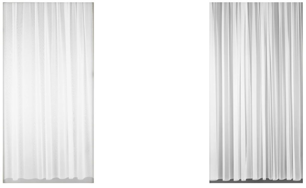
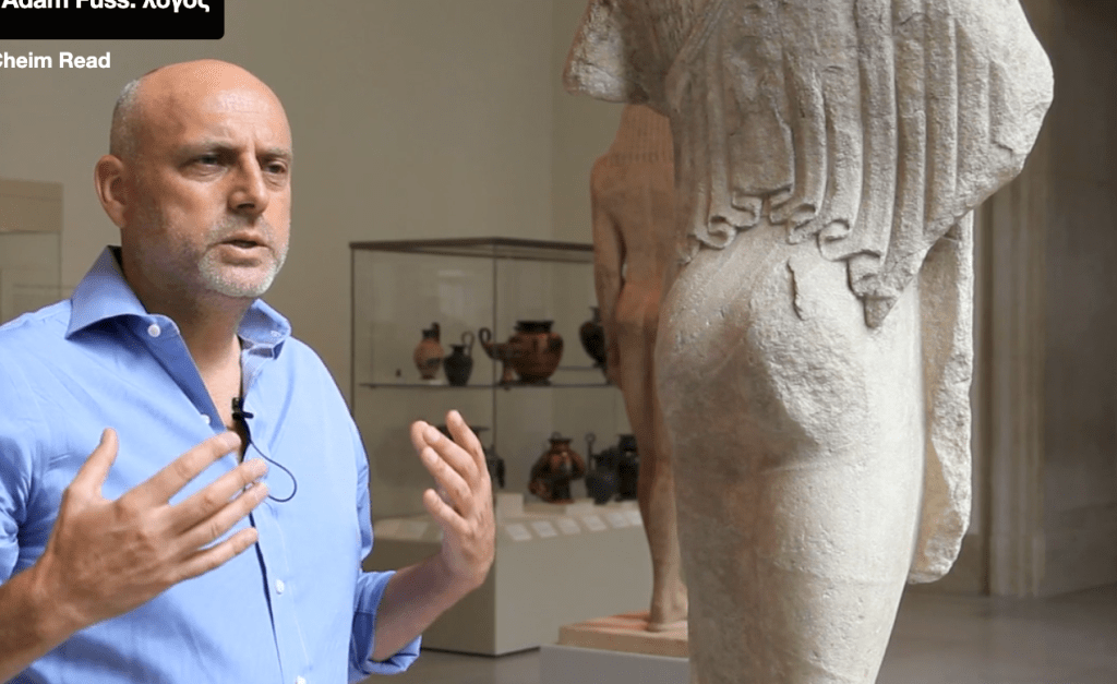
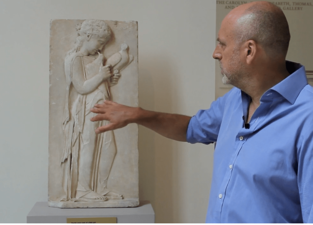
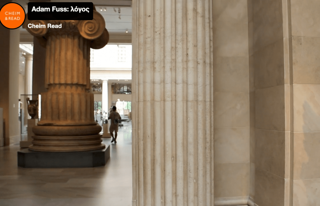
For his work with Curtains and snakes, he revisits antique classical greek sculpture to interpret his own work. As with all of us, our ideas and thoughts come from somewhere and Fuss likes to explore this in depth to find meaning behind his art, often after the fact. He illustrates in a short film how its possible that earlier influences have derived from spending time in classical galleries. For me the parallels between these works contain remarkably similar visual qualities to the sculptures and structures that he outlines here:
I had myself during my BA, produced a small series of images just shot in my own bathroom. I still revisit this work now as I find it pleasing. I love the texture and feel of Italian marble and reflecting on it now, I wonder if this is why I like these images so much. For me this reminds me of the importance of digging deeper into the inspiration behind my own work to try and extract real meaning, as demonstrated here. His experimentation is highly ambitious, it may be that I am unable to work at this scale for this module but its something to inspire the development of my FMP.
Untitled, Adam Fuss. 2015
Fuss—”the spiritual symbolist among the non-conventional photographers” (Yasi Alipour, Brooklyn Rail)
Having broadly tried cyanotype and anthoypes previously, I have researched several alternative process practitioners, to see how to broaden my knowledge and understanding. I’ve found lots of online resources as well as books, there are plenty of creatives trying many different techniques, including sustainable practices alongside the more harsh, heavily chemical based processes. There is quite an overwhelming choice of ideas and it seems that almost anything goes, when it comes to experimentation. I have decided that I will try and refine some of the skills I’ve aleady learned, for the sake of ensuring I don’t disappear down a rabbit hole which will likely cost me dearly in time and resources!
This is the page where I will be trying to refine my skills with this process and share my failures and successes.
Initially, with cyanotype, gum bichromate & salt printing in mind, I tried a few images that I had to hand, by printing digital negatives onto a standard inkjet acetate. I then used this for a few experiments but realised quite quickly that the ink wasn’t dense or contrasting enough (see images below) To improve this I would need to obtain higher quality acetate and create a preset on photoshop for printing. I would also need to look at images with stronger contrast, as these would be better suited to the processes I am looking at.
Acetates on standard inkjet in black & white:
I used the resource ‘The Experimental Darkroom’ by Christina Z. Anderson to set up my photoshop preset:
I also invested in Fotospeed inkjet digital contact film, which would allow the ink to better adhere to the acetate.
Another issue I came up against was the type of paper used. I did find that using basic cartridge paper wasn’t sufficient to keep the solution on the page and so during the wash process, I found it faded to almost nothing. To remedy this, again I chose to invest in something more reliable, having researched in Christina Z. Andersons book. I bought Hahneműhle Platinum Rag 300gsm in natural white. It is acid free which enables it to have good clearing properties.
I also tried using a Khadi paper which I’ve had for some time. It has a rough, uneven texture that I particularly love. It has torn uneven edges and lends itself well to a slow process. Concerns are whether it will be a strong enough substrate to stand the wash process and whether it is too absorbent, which may have the opposite effect of the cartridge paper by making the chemicals cling and not wash out..
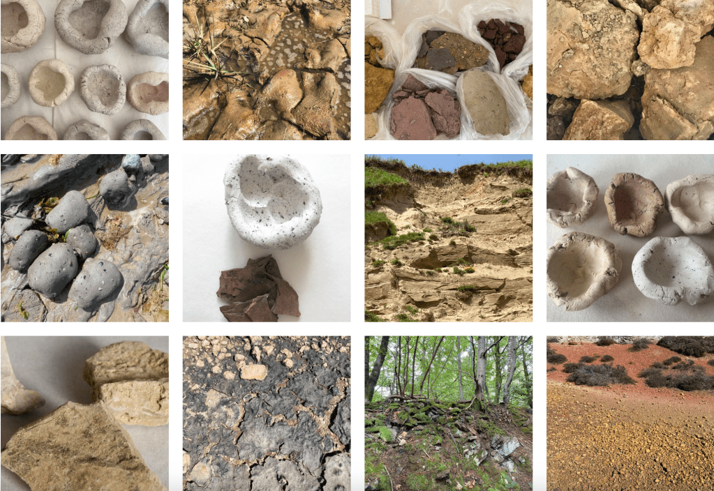
Visited in February – interesting works of art and scientific research into the life of soil and its importance to the planet. The exhibition brought together artists, scientists and other interested people to participate in a conversation about soil and its powerful potential regarding the health of the planet. Soil is increasingly being understood as a key factor in sustainability and through various approaches in art and science, this exhibition invites visitors to consider its crucial role in our planet’s long term health. “The exhibition delivers a message of hope and urgency, encouraging a more sustainable, harmonious relationship with the Earth..” (Somerset House)
The exhibition was co-curated by ‘The Land Gardeners’ Henrietta Courtauld and Bridget Elworthy, curator and writer May Rosenthal Sloane and Claire Cattrall, senior curator at Somerset house.
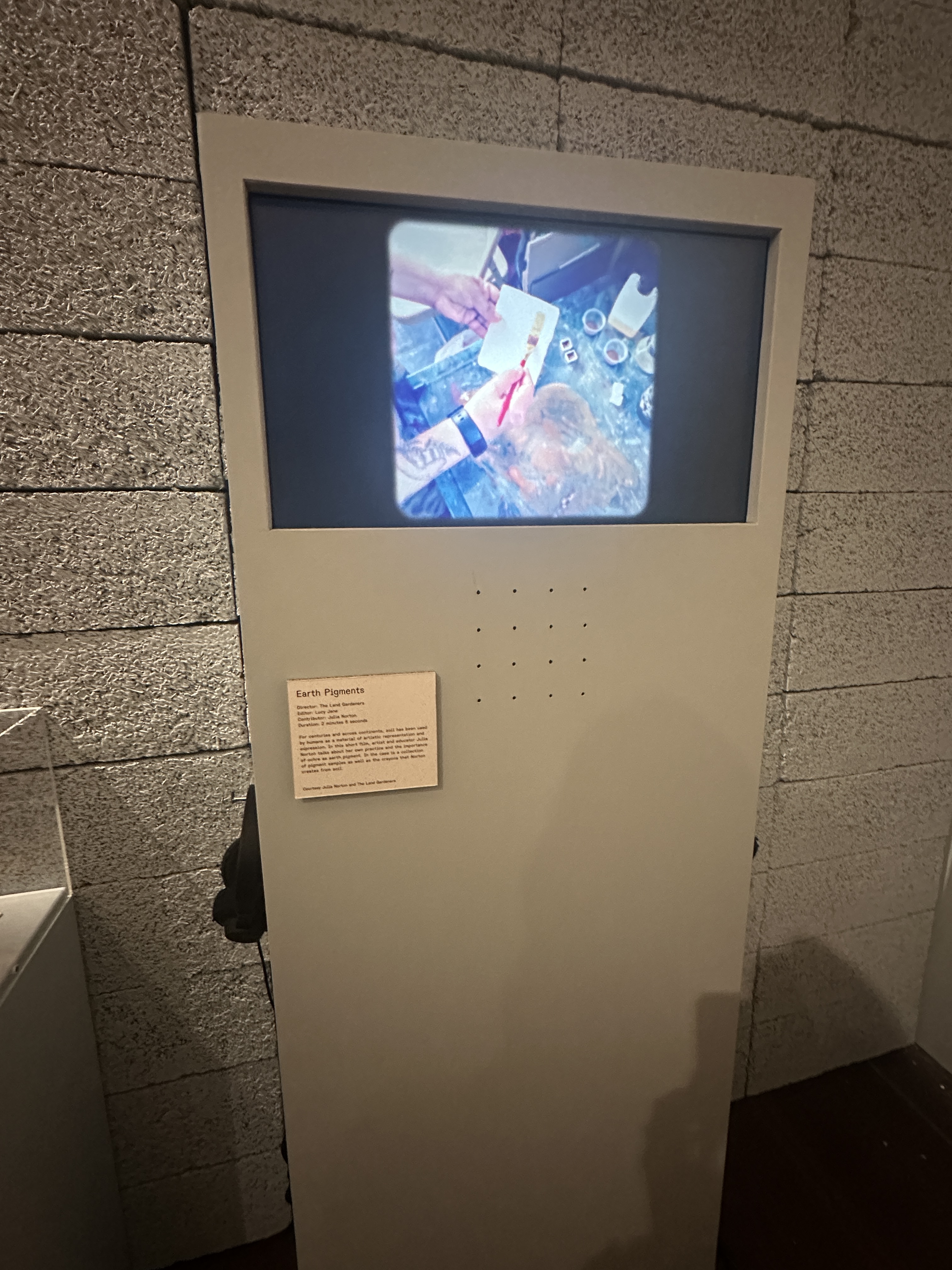
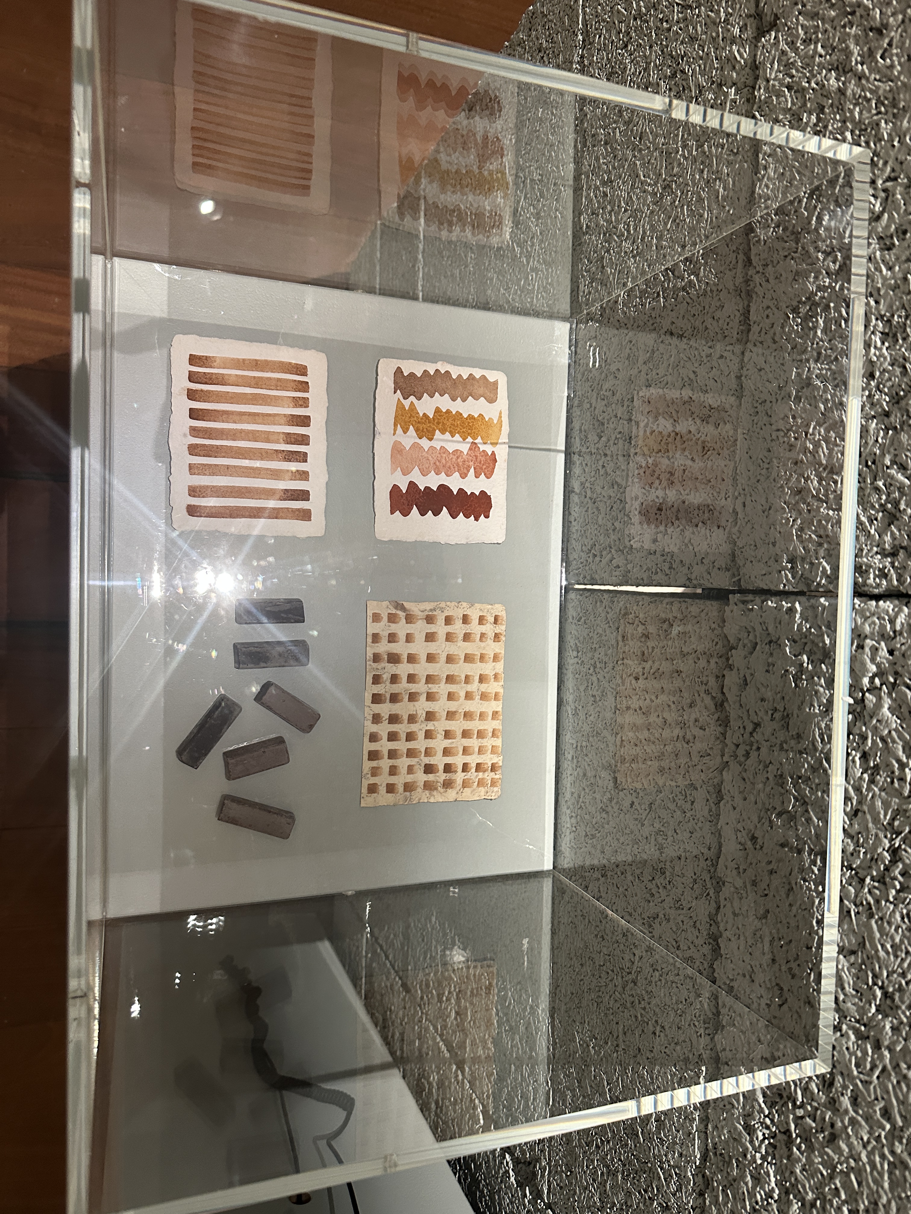
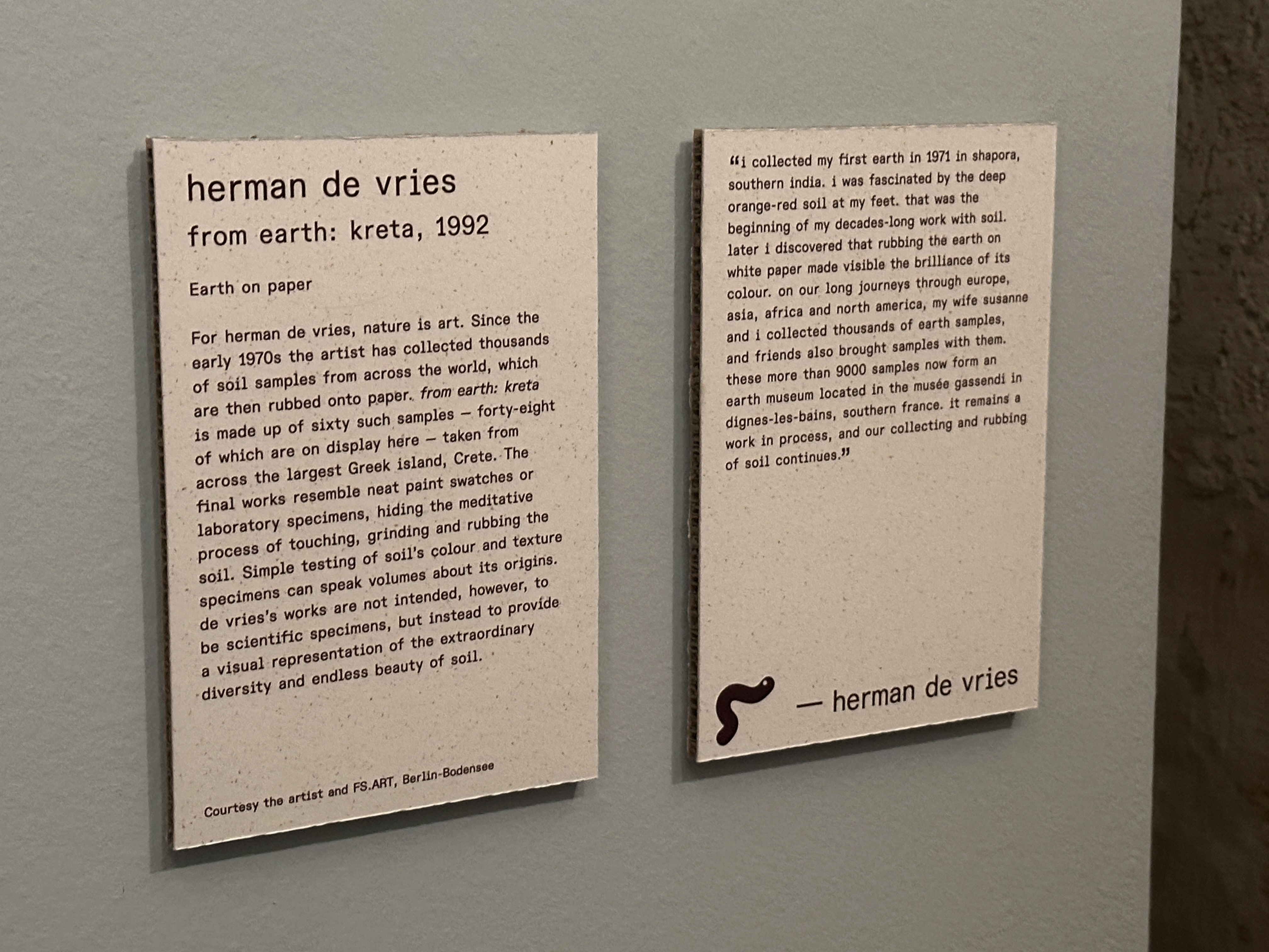
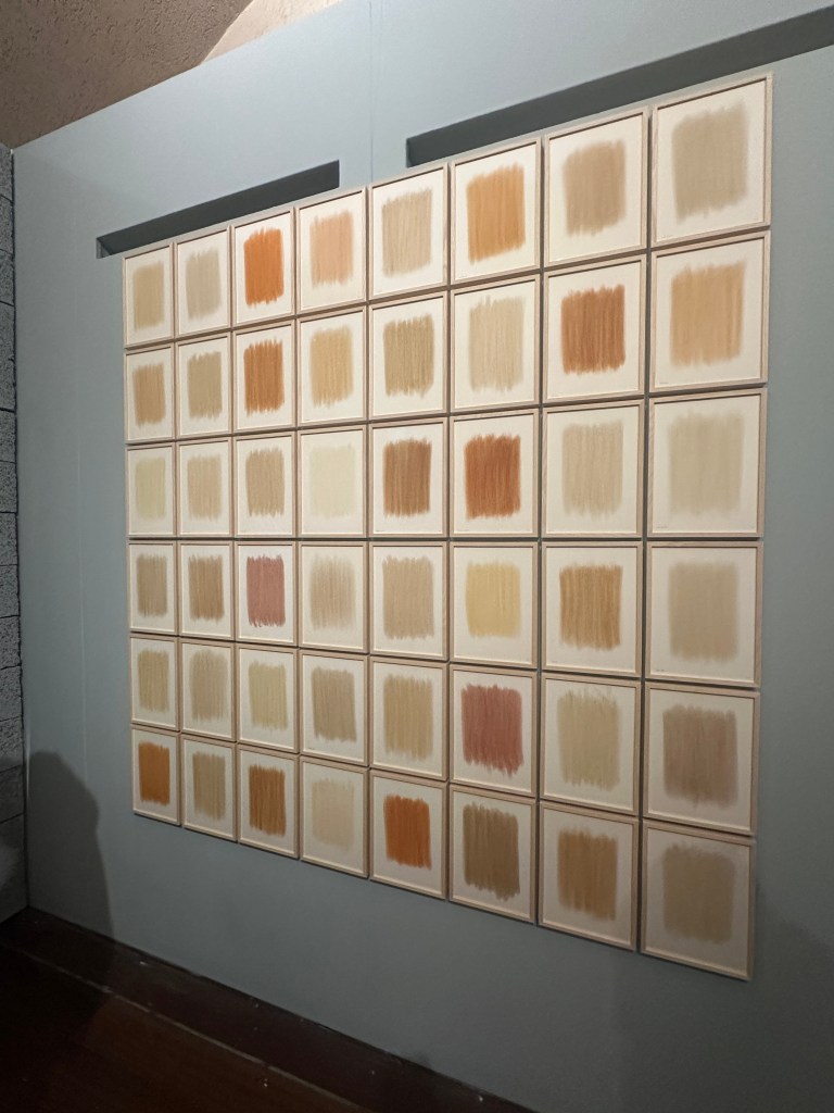
Most interesting for me, were some of the works on display which use the soil itself to create their art. Henrietta and Bridget had a short film on display at the exhibit, showing how they take samples of the earth and then paint them onto paper to demonstrate the wide gamut of pigments that can be found in the earth and its potential as an artists medium. Similarly, Herman De Vries who has since the 1970’s collected thousands of samples from around the world, for similar reasons but to bring awareness to us all about the vast beauty of that which is beneath our feet. The array of colours below are from samples taken on Crete.
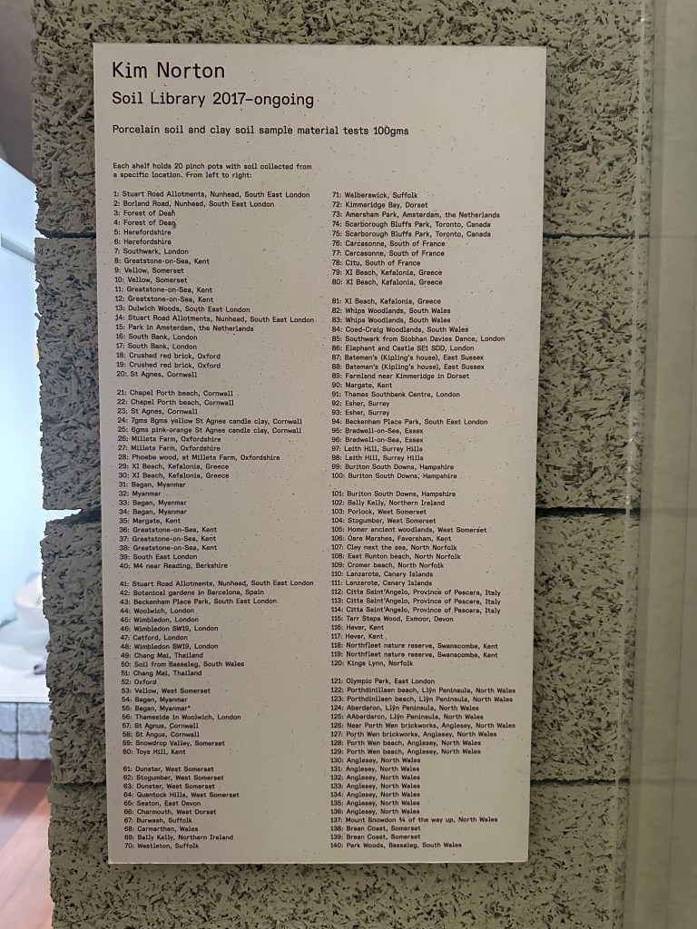
Kim Nortons ‘Soil library archive’ has been ongoing since 2017. So far she has collected over 160 samples from places in the UK, Europe North America and Asia. She only ever takes small amounts so as to minimise impact. She mixes these into porcelain and / or clay to make small pots which is what we saw on display at the exhibition.
These works offer potentially interesting ideas for what could be used in alternative processes for photography. I am interested in the idea of using samples of earth from the areas which I make my work and using them to perhaps tone my prints or lay over the top somehow.
I have discovered a Ukrainian photographer, Valerii Veduta, who prints his photos using soil as the pigment in the gum dichromate process. He does this by candle light, as though in a bunker somewhere, in response to the current war in his home country. I like the idea of using materials of significance, in doing so adds an essence of something more personal and meaningful. His series is called ‘War Time Family Album’ and he describes it as a poem of sorts, a documentation of their lives, although way behind the front line, still trying to balance a strange ‘normality. Knowing the situation in Ukraine and seeing his prints, does give them a haunting quality. Using this old process, gives a timeless feel to the prints and I thought about family albums of old.
Like many people, I am drawn to water. In Amy Jane Beers book ‘The Flow’ she describes how she revisted a river in which she lost a close friend, years before in a paddling accident. She hadn’t been back since, She revisited around 7 years later, expecting to feel the overwhelming sadness all over again but equally determined to find peace and closure. What she discovered though, was a sense of wonder and a gentle pull to remain in place and study further. Just below the rapid where her friend died, she noticed a calm spot amongst the chaos of the bubbling white water, an eddyline, an interface of opposing flows. She studied this for a while, noticing all of the features of the river and felt a strong sense of past and present, life and death. This compelled her to study water and river flow in detail, in a more attentive way than her earlier years of paddling adventure. The result of this study, is her book ‘The Flow’
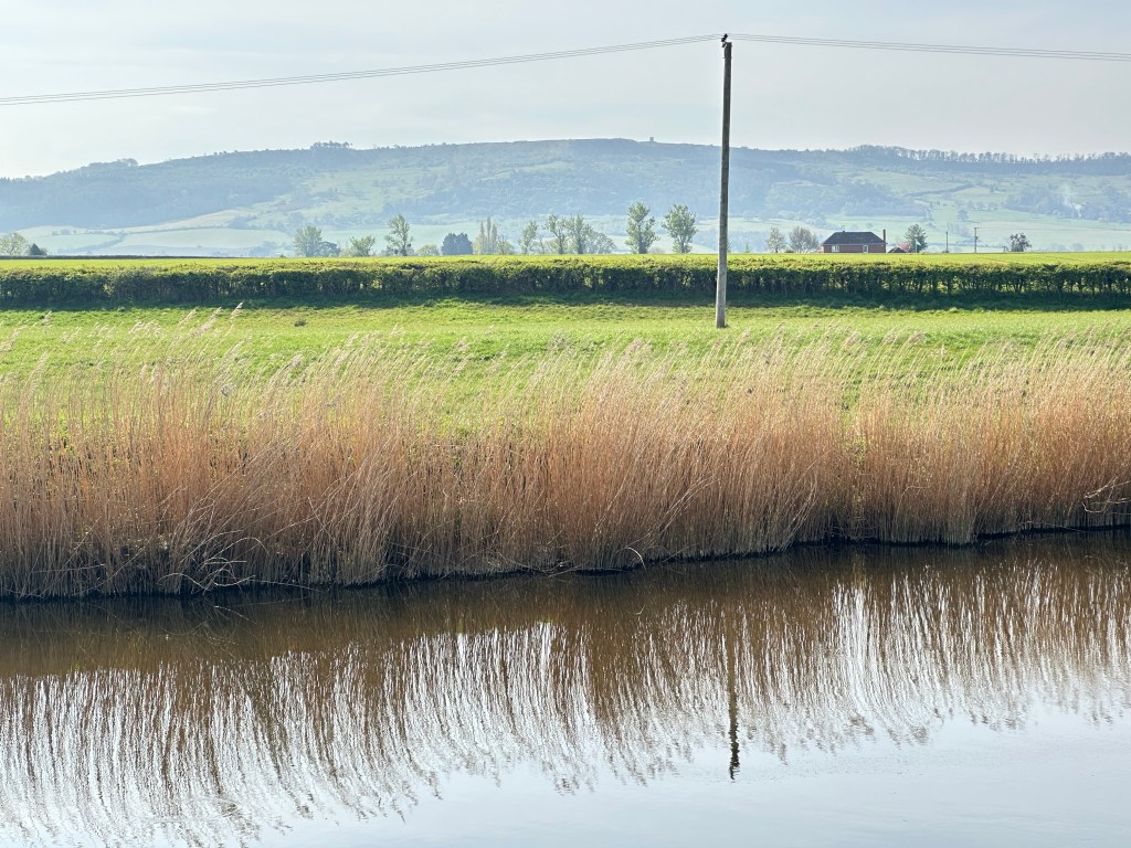
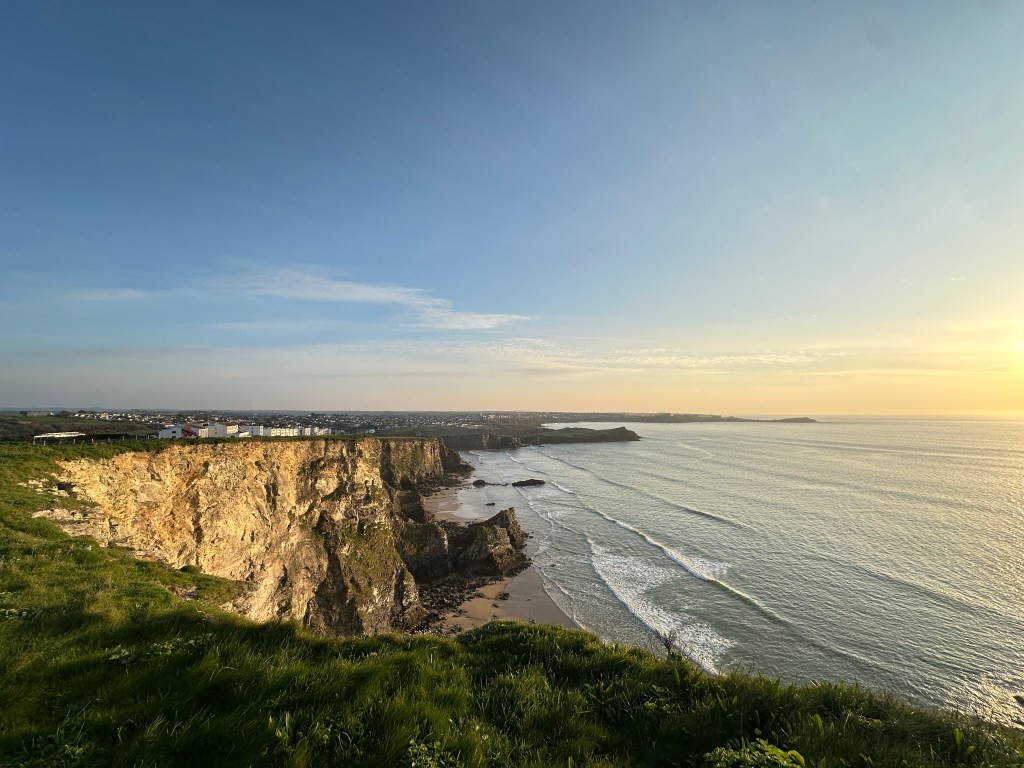
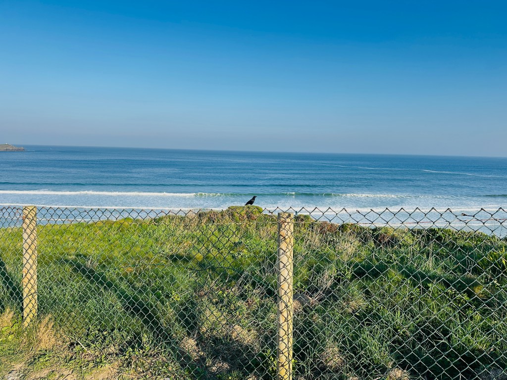
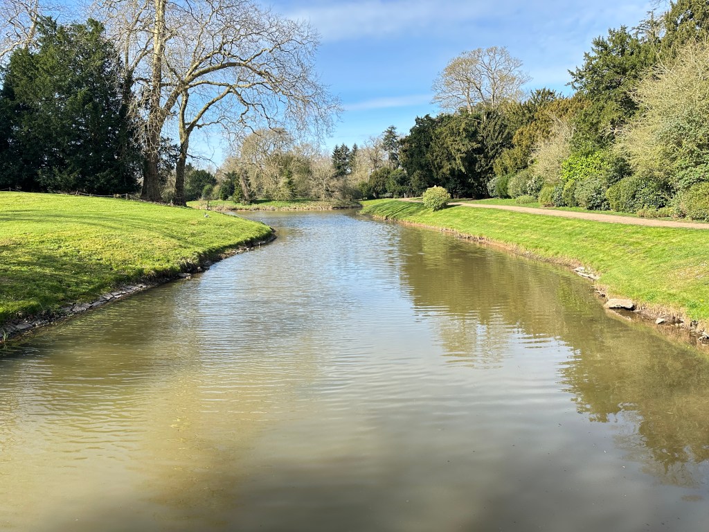
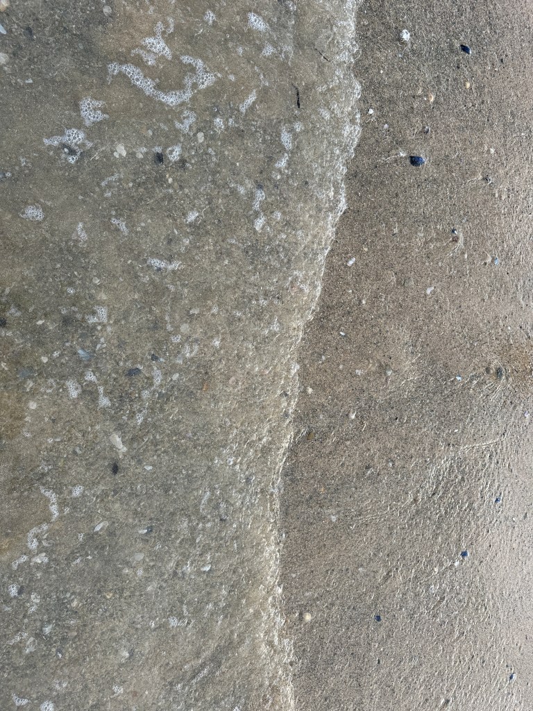
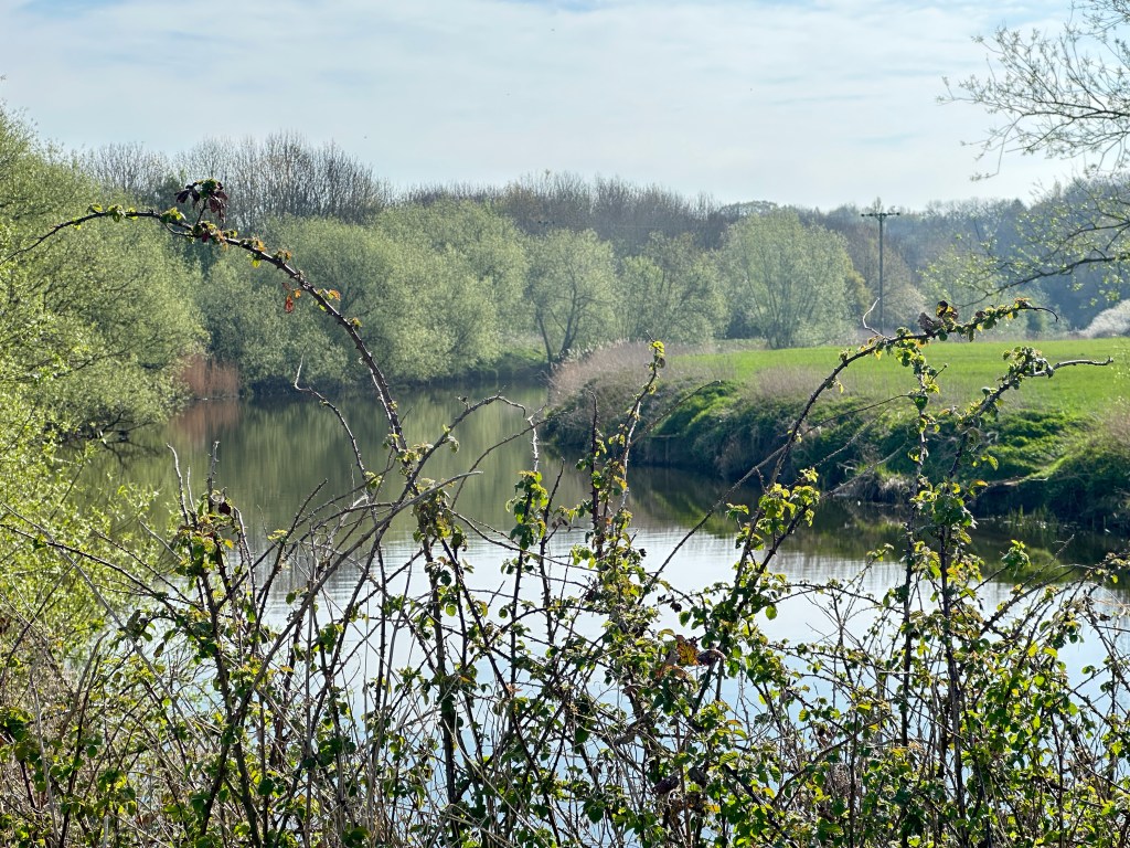
It is Amy Janes description of feeling pulled to stay by the water and explore further, in an attentive and immersive way that resonates. Whether it is the sea, a river or a lake or pond, there is real sense that there is something to be discovered or considered in more detail. Tranquility is synonymous with water, the sound of it and the feel of it. I have often headed out for a walk or run and ended up near the water and found it almost impossible to not stop to listen and watch. The shapes and movement of the flow, in the case of still water it is the way the light bounces and changes constantly. I will almost always take a photograph whilst passing through
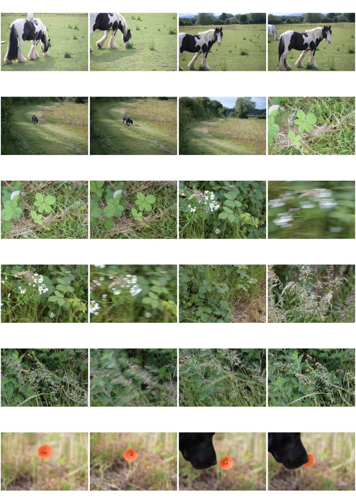
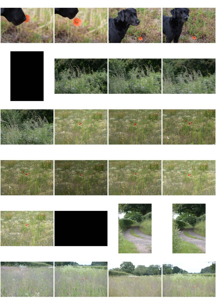
I’ve looked at my camera roll on my phone from the last few weeks and I can see many examples of this. All the photographs below are frequent moments of waiting and watching, absorbed in the sight and sound of water and its surrounding landscape.
As well as Amy Jane Beers book above, I’ve read several books on the subject of water, both fact and fiction based. For example, Bonnie Tsui’s ‘Why We Swim’ and Susan Soderburghs ‘Winter Swimming’. I have a copy of the popular Wild Swimming reference guide and have recently bought Kate Rews book ‘ The Outdoor Swimmers’ Handbook: Collected Wisdom on the Art, Sport and Science of Outdoor Swimming’ I’ve never consdiered why I am fascinated and drawn to the theme of water.
Without doubt, my favourite pre teen books were by BB (Denys Watkins-Pitchford) The Little Grey Men and Down the Brightstream. The books tell the tale of ‘The last four gnomes in Britain’ who lived on the banks of Folly brook, and have an epic adventure along the brook trying to find their lost friend. BB’s story is set against the background of the British countryside and spans through Spring, Summer and Autumn, with rich descriptions of the water and riverbank throughout;
“At this spot, for some reason known only to itself, the Folly brook turned at a right angle. Beneath the oak the water had washed away the sandy bank, and many winter floods had laid bare some of the massive hawser roots which projected in a twisted tangle from the soil of the bank. The sun, shining full on the steep bluff, threw shadows from the overhanging roots, so that underneath all was darkness.”
His own illustrations (he was an artist under his own name, before he became a writer) feature throughout the books and are a reflection of his own childhood experiences. As a skilled observer, he gave incredibly poetic and enchanting descriptions of the natural world, enabling the reader to form detailed and rich images in their mind. In part, I imagine his dedication to both his art and writing stems from his attachment to the poem below, which came from an old Cumbrian Gravestone and was the preface of every book he wrote:
The wonder of the world The beauty and the power The shapes of things, Their colours, light and shades These I saw, Look ye also while life lasts.
I believe that my personal fascination with water comes in part, from these stories. I know that I am not unique in feeling charmed and entranced by natural bodies of water, the sheer volume of literature and reference material available tells me that but its meditative qualities invoke deep personal feelings which are unique to me and it is this which brings me back repeatedly.
Inspiring material & quotes:
Mary Olivers’ essay about creativity and childhood self titled: ‘Of Power and Time’ (from her book ‘Upstream)
On the science of water. H-O-H is a bent molecule. If it was straight, life on earth wouldn’t exist. (Elif Shafak)