Module summary and reflection

Looking back at my BA, I realise I always sought to deepen my understanding of both analogue processes and digital post-processing. Despite my efforts, I never quite managed to fully refine these skills in a way that supported the themes and styles of photography I wanted to explore. This module has provided me with the opportunity to delve deeper into these areas, allowing me to solidify my knowledge and establish a more consistent approach to my work.

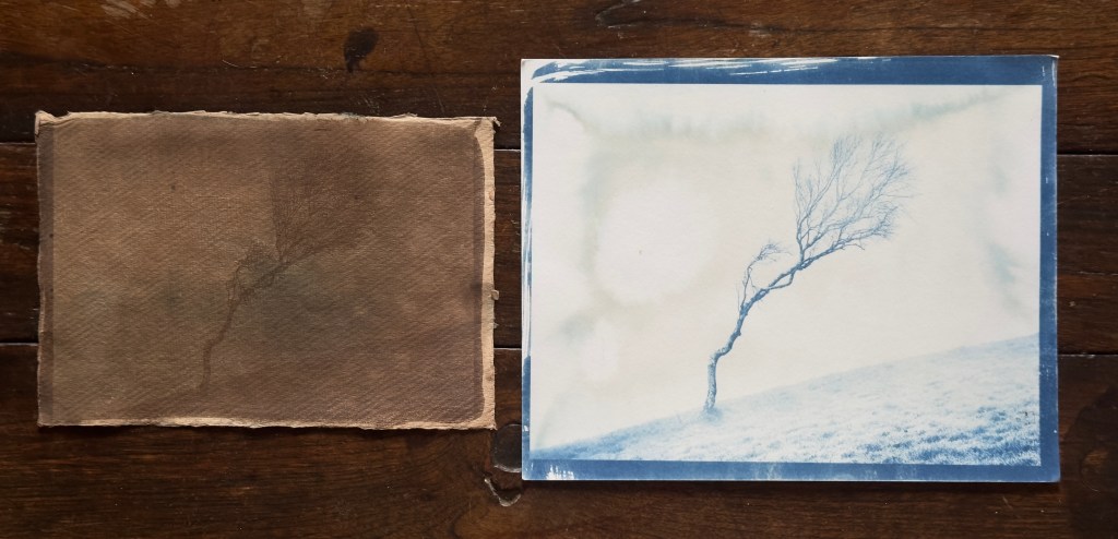
Throughout the process, I had many questions about how different chemicals and processes would yield varying results. I now have a much clearer understanding of how certain chemicals behave and the varying sensitivities of different processes. With a newly acquired level of competence, I feel confident in my ability to push beyond these boundaries and produce more distinctive work for my final major project.

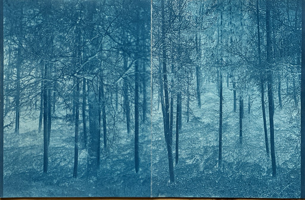
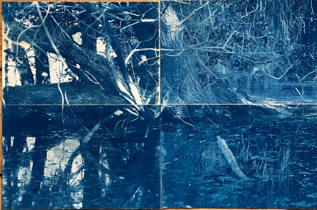
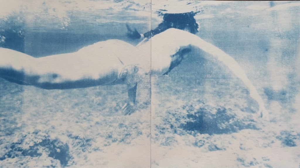
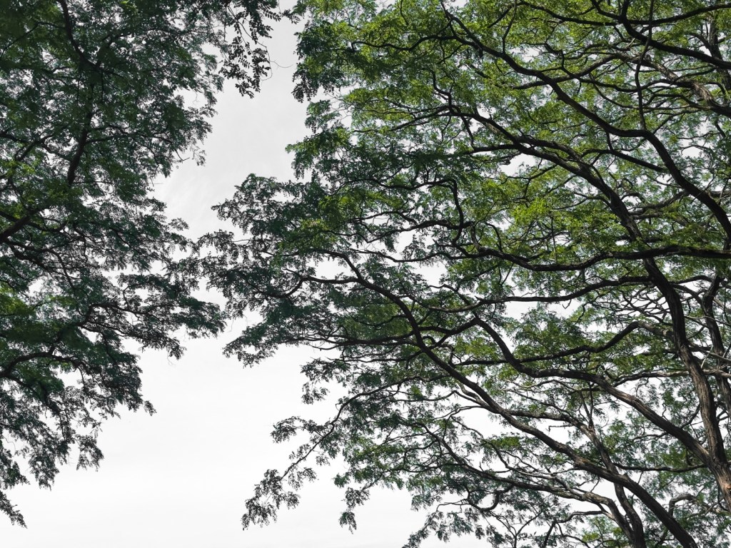
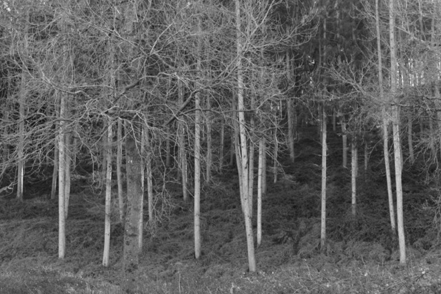
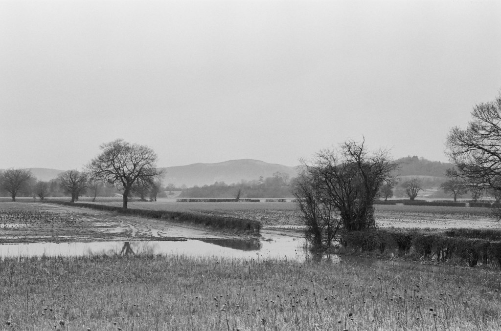
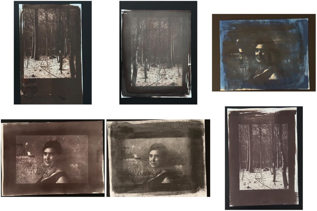
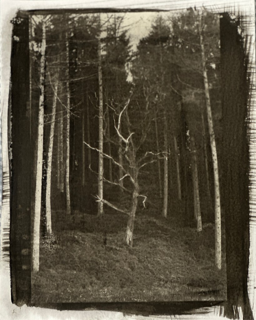
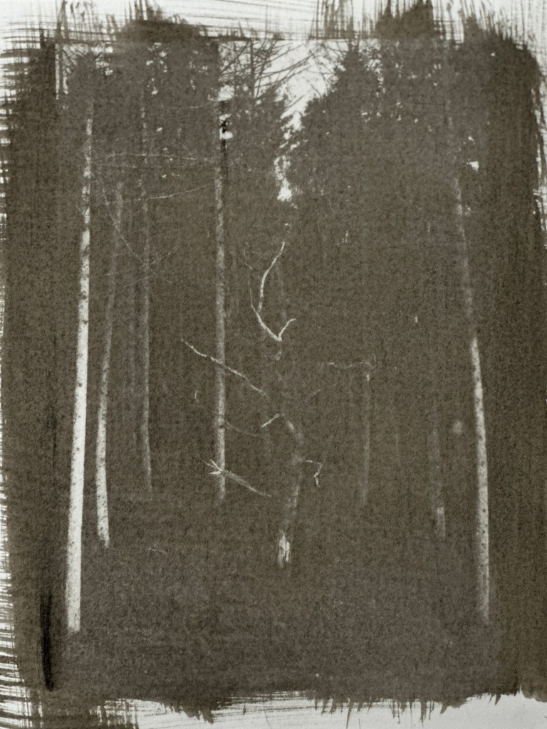
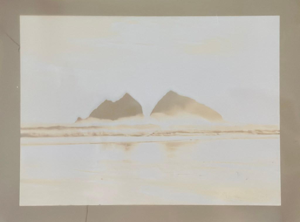
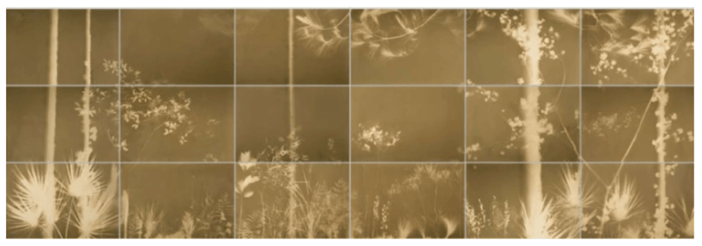
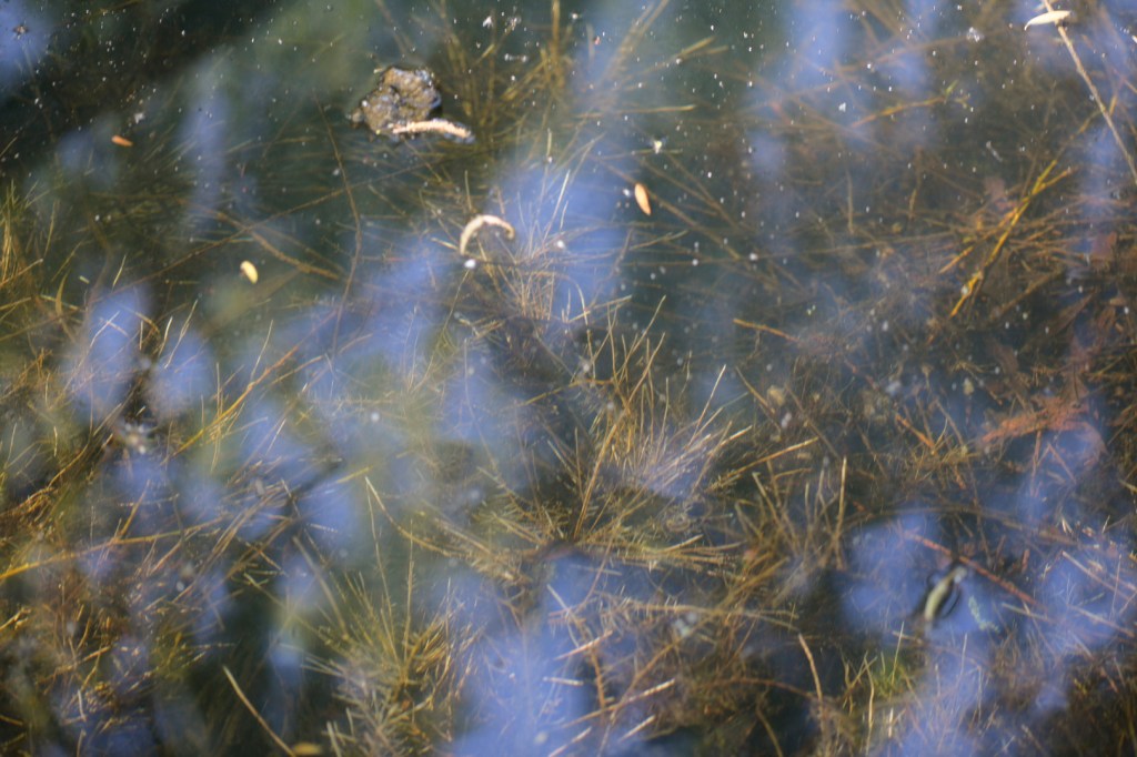
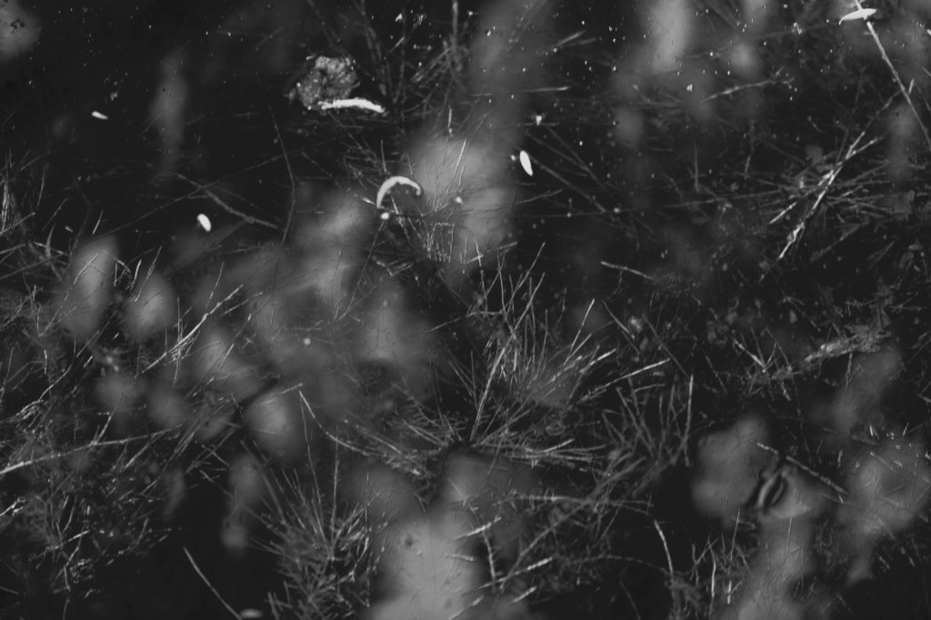
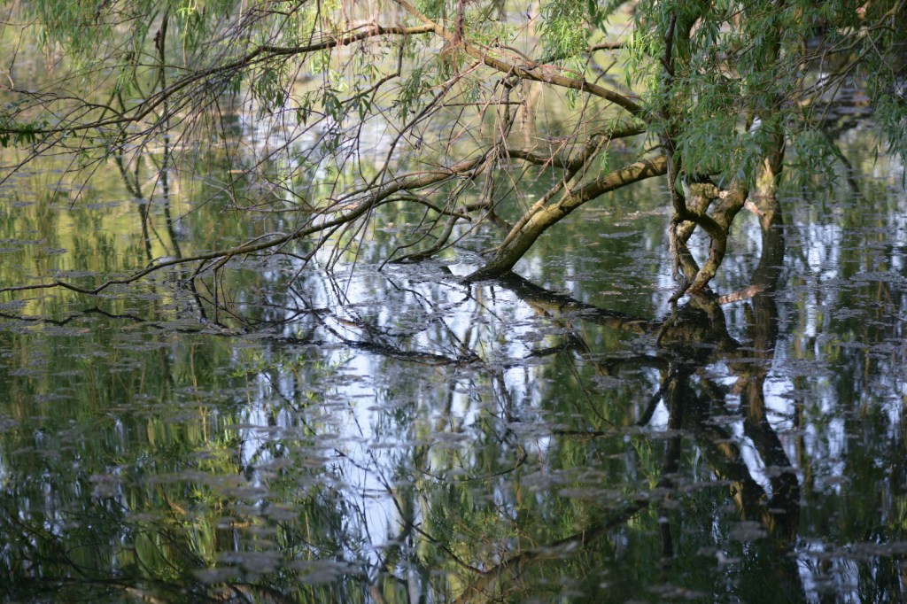
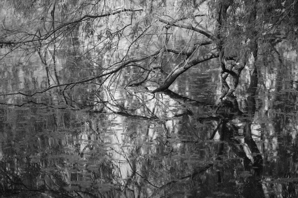
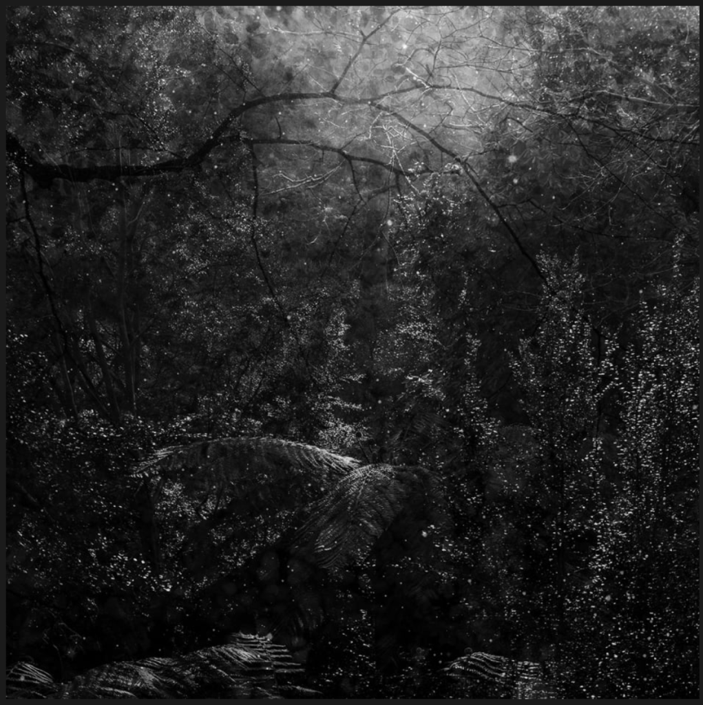
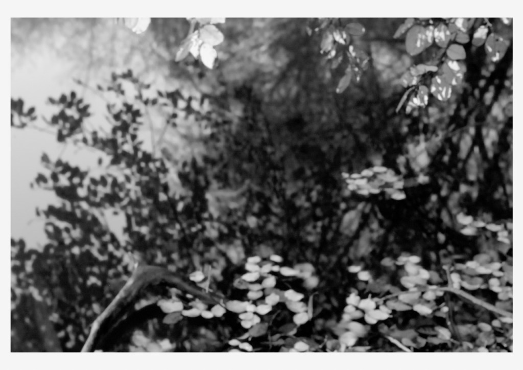
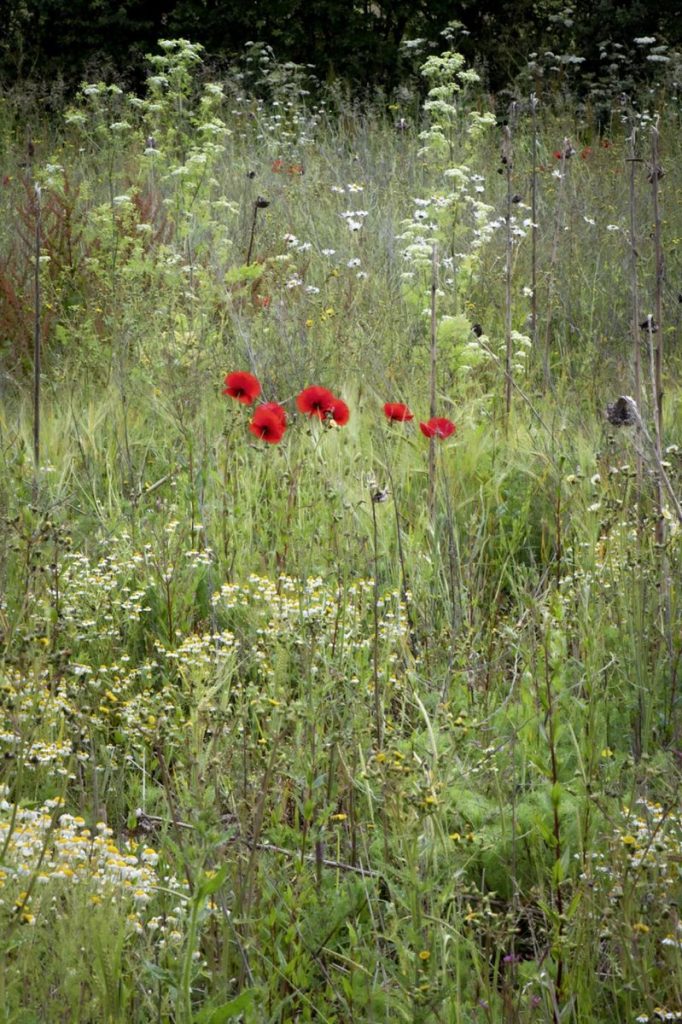
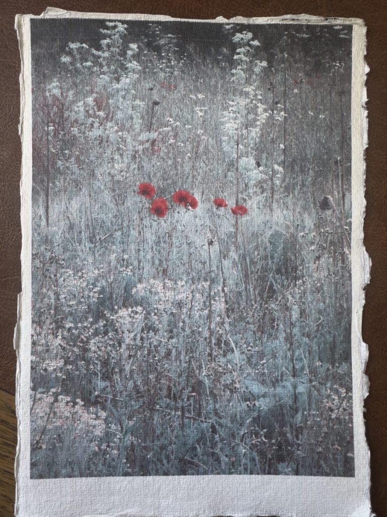
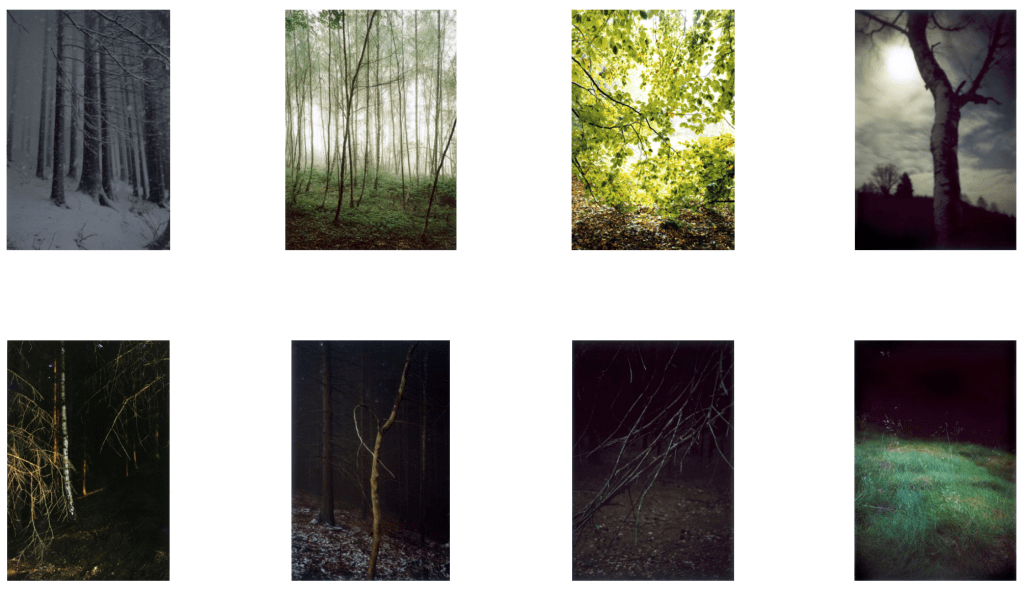
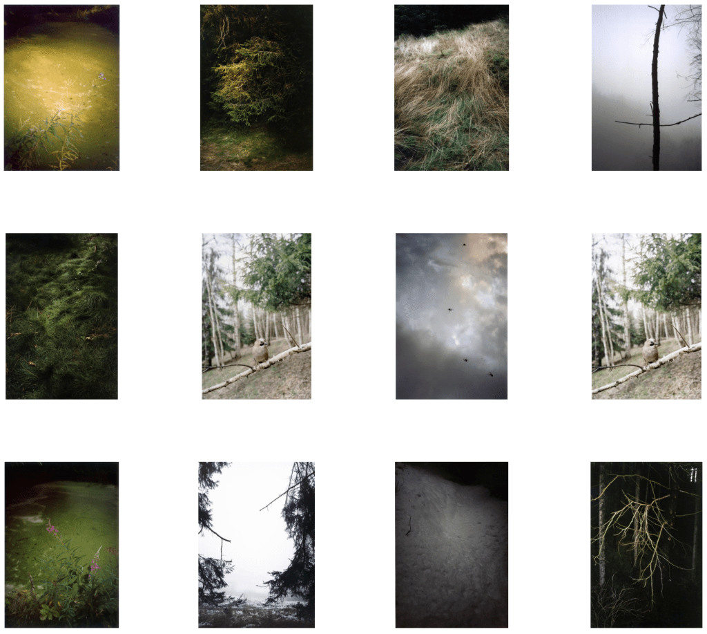
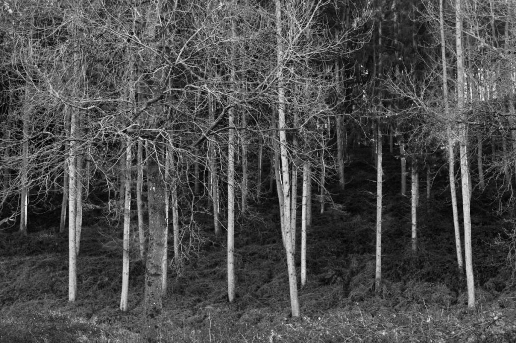
My central theme, landscapes that evoke memory, impermanence, and a sense of place, continues to be at the core of my practice. Throughout this module, I have experimented with different ways to express these ideas. By working with both new and existing images, and applying new techniques and styles, I can now see clearer opportunities to inject more originality into my work. Researching key practitioners, many of whom were unfamiliar to me, has shown me that the possibilities are vast, as long as I dedicate time to exploration and experimentation.

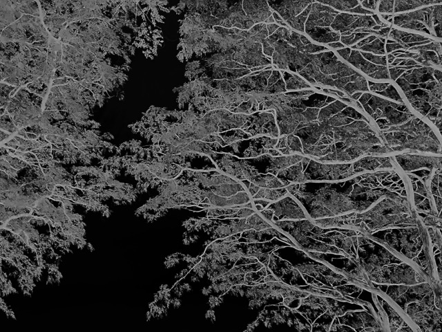
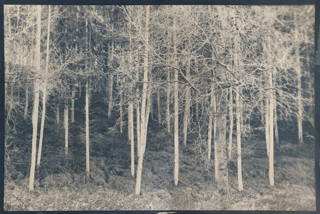
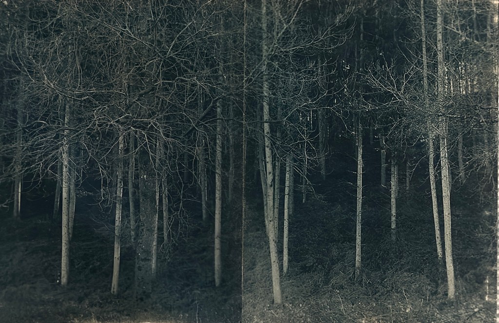
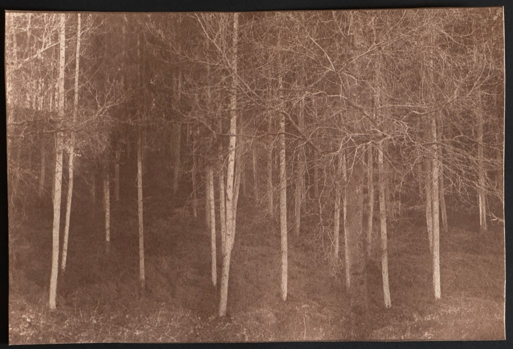
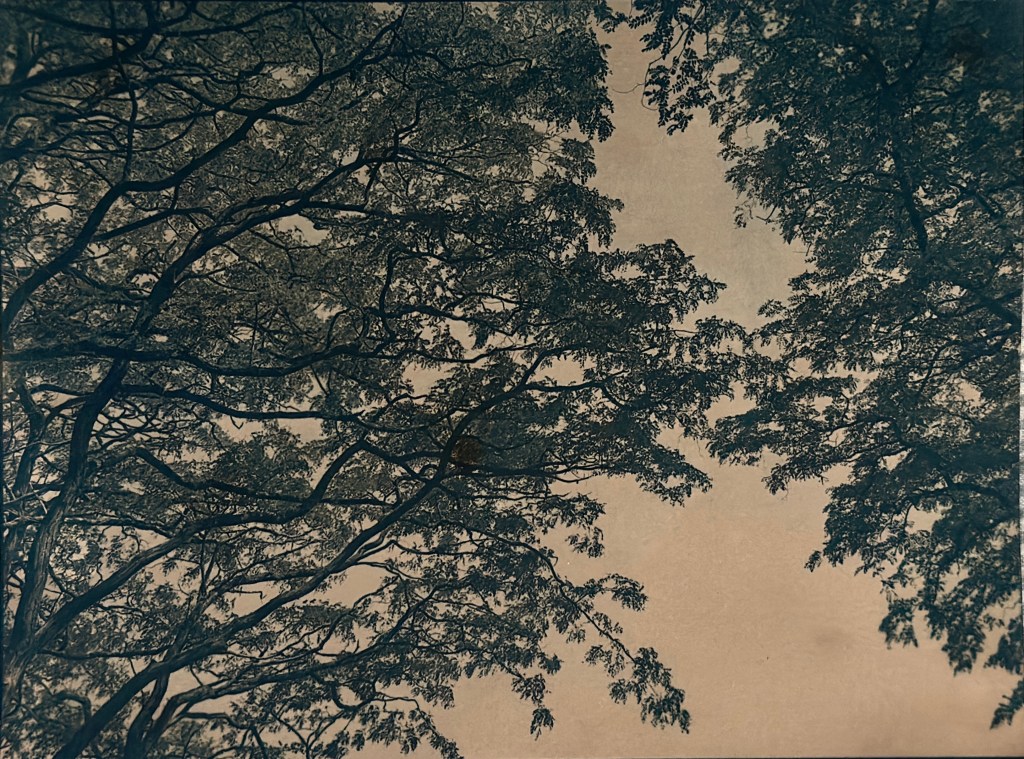
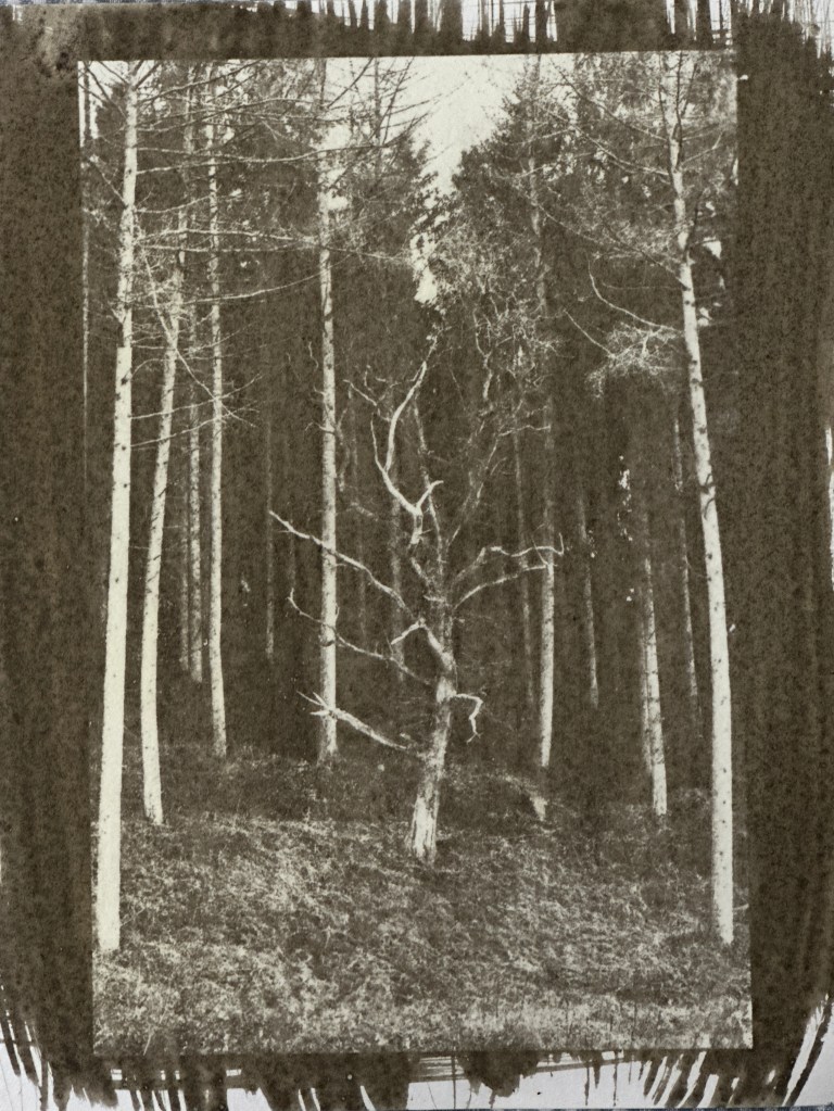
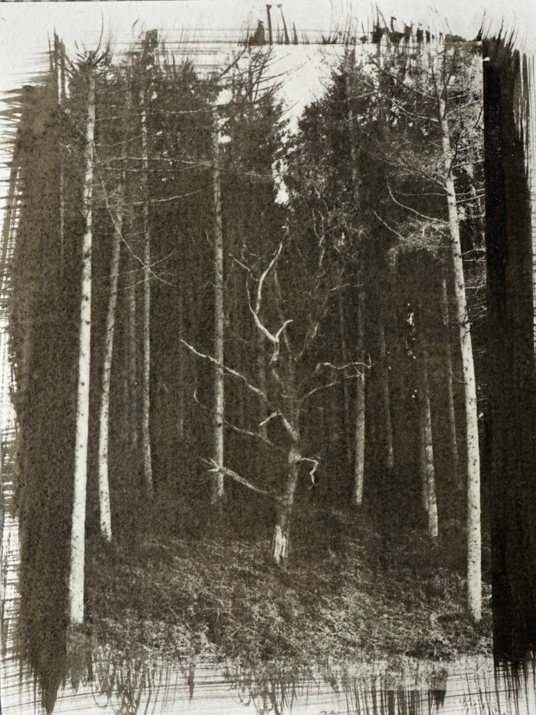
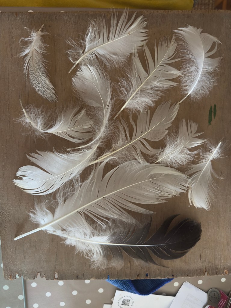
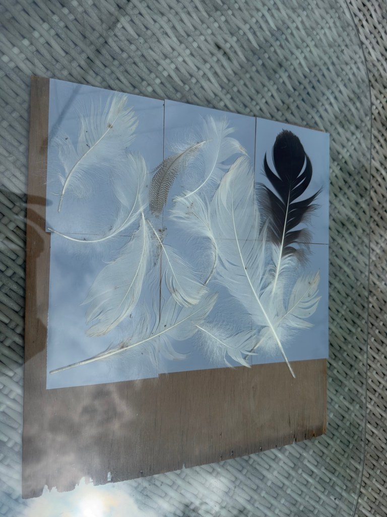
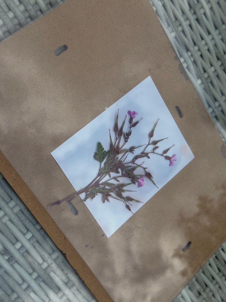
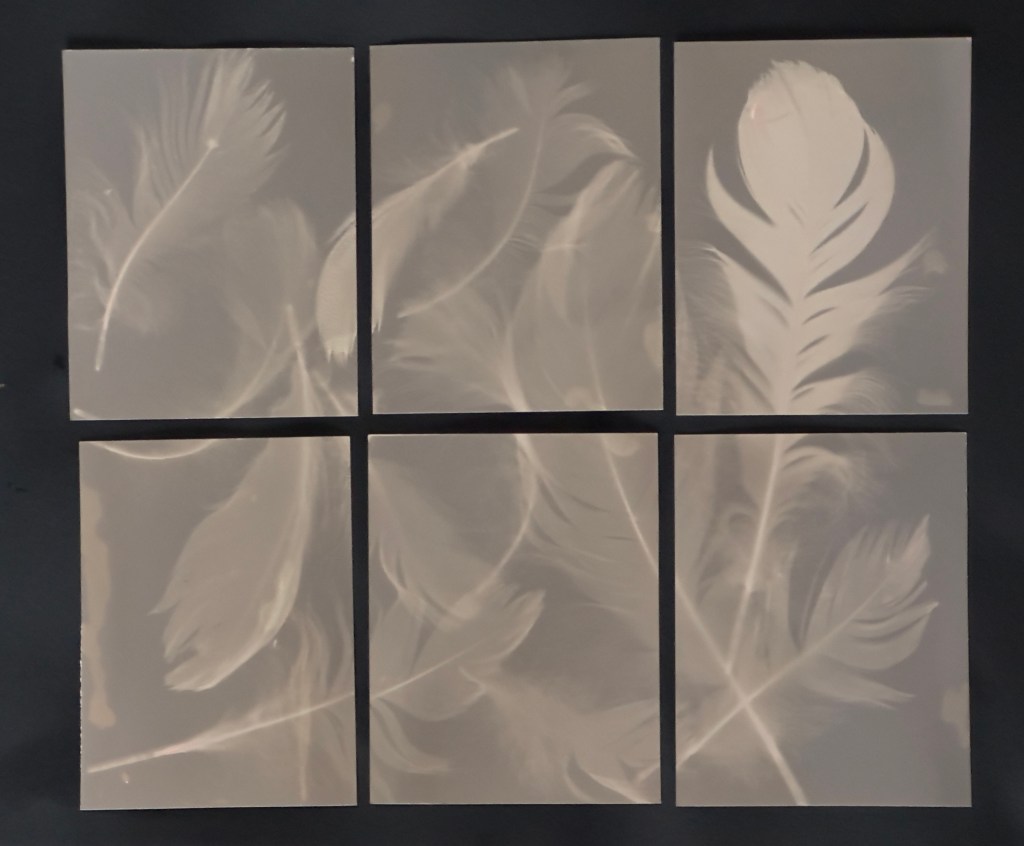
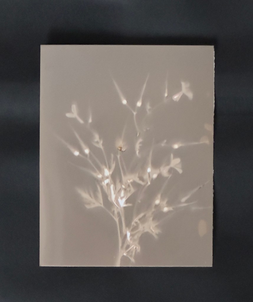
One process that has particularly stood out is the cyanotype technique, which I’ve revisited with new methods. This has opened up exciting opportunities for enhancing the originality and diversity of my work. Additionally, my experiments with gum bichromate have been equally rewarding, and I can see how this practice could add a rich, tactile dimension to a body of work, particularly in the context of a book project.

However, there have been frustrations along the way as I’ve sought to balance my time between two modules. I’ve had to make compromises on some of my ideas and investigations. At the start of the course, I was really looking forward to this module, anticipating a chance to fully immerse myself in experimentation and push the boundaries of my ideas, especially in terms of challenging common conventions. While I’ve explored new techniques and approaches, the opportunity to truly dive deep into these areas has been limited due to the double workload. That said, while my submission for this module may not be as thorough as I initially intended, it has certainly equipped me with valuable knowledge and skills for the next stage of my development.

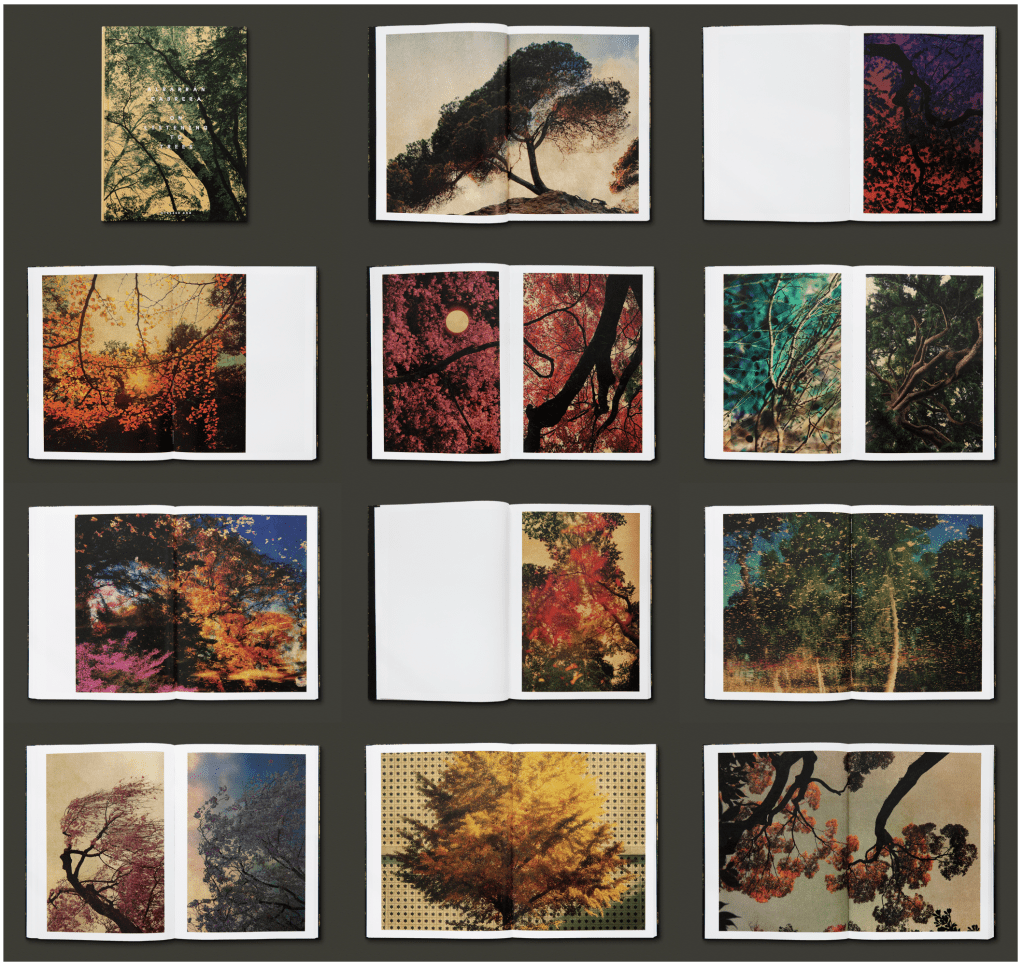
These experiments have also led me to think about the future of my work in new ways. I’ve long viewed photographs as objects in their own right, and I now see how creating a book which incorporates mixed-media could become an object to cherish, as Albarran and Cabrera suggest. This would complement an ambitious exhibition of prints, which will ultimately form a compelling final major project and become a jump off point into my practice beyond this Masters Degree.

Cyanotype

This will be the biggest contributor to my experimentation as I attempt to refine my skills in producing consistent cyanotypes and trying different techniques for changing the colour and tones.

I have focussed most of my attention on this process. The reasons are simple and that is that its accessible and versatile. I like that you can bleach & tone, add other chemicals to alter the reaction and so it feels a little like playing about with the chemistry set I had when I was 10. I have been reminded of the role and relationships of different chemicals and how they might impact a result.

All of my tests are in the folder which accompanies this module. I had plenty of ‘fails’ in so far as they were over or underexposed or the negative wasn’t quite right and I’ve put these in a separate folder for the assessment, rather than include them all on this page. I found I needed to be methodical about laying the glass over the top as there were blurred sections in several.. this was frustrating when I made several prints for a split image.

Some of these earlier tests I made were done at university using the consistency of the UV lightbox. I used basic cartridge paper which wasn’t always successful but in testing negative quality and exposure times it was better to use this rather than use too much of the higher quality paper.

Early tests and experiments, with some success:

You can see in the tests above that there are several errors – these are down to many different factors but the result often of inconsistency in my process.

  • In the collage (top middle) I had very different results in each print so when I tried to put them together the print looked ambiguous, this is also in part, down to my choice of negative.
  • For the first diptych (top left) it needed a better negative and longer wash. I also think I over exposed as the blues were very strong. I did use hydrogen peroxide in the wash which may have affected it too.
  • in the third image – (top right) I initially had what I thought was a successful cyanotype print but having left it for 24 hours it had developed a brown/blue watermark. This could be down to lying it flat when wet and not quite rinsing properly. The other image was a test for bleaching and toning, I deliberately used a failed cyanotype to try this out (failed due to too much blue left on the print) and you can see how it has stained it too deeply. I had left it in the bleach for several hours but this didn’t remove all the blue.
  • In the diptych print (bottom) I took a screenshot from an underwater video that I took last summer when in Menorca. I like the effect of the water in cyanotypes, although the print itself needs more refinement I think this does demonstrate its versatility.

Refining my process:

Below are the images and digital negatives I chose to continue this process with:

Both of the photographs are of key places and moments aligned with my theme. Ashton Woods is next to my home, I see this view several times a week and it has been the subject of some controversy recently with a new landowner closing off access to it. As a result, I co ordinated a local effort to have the area added to the definitive footpaths list. Sadly it will take years to reach a conclusion. In the shot with the canopy of the Acers, it was taken when I was sat in an ice bath, I had sat trying to catch my breath and used the canopy as a focus to regulate my breathing. Once relaxed and acclimatised, I wanted to record the scene.

Successes:

These are by far my favourite pieces. In the top image I exposed the cyanotype before toning in coffee grinds. I love the effect of this when I compare to the third image down, in which I had bleached for a period of time and then toned in strong tea. I enjoy both results but the first print has retained more detail and I particularly like the greyer blue effect.

For the second image down, I made a diptych, slicing the image in half and then exposed on two sheets of 10×8 rag paper, as before. I also soaked this in coffee grounds, it is a much deeper blue (as a result of a different exposure) and is darker overall. I like the tones here and darker shadows.

The final image is my favourite overall. I toned this in coffee also and the effect is exactly what I was after. I have been greatly inspired by the work of Albarran and Cabrera and this was my attempt at creating something along those lines. It is reminiscent of Japanese art. The Japanese practice of ‘Shinrin Yoku’ has gathered much attention in recent years, it is a form of relaxation that involves immersing oneself in nature. Its aims are to find peace and quiet in woodland spaces, absorbing the sights and sounds whilst breathing deeply. It is a mindful experience, which links in to the cold water immersion that I was practicing at the time. I did attempt a larger scale version, using the bleach and tone process, but it didn’t work very well in time for my submission. I lost too much detail unfortunately. I may attempt to use this once I have access to the larger printers at university in September.

Shoots on film

January 2025 – Severn Stoke, Worcs.

This was a shoot using my 35mm Minolta, which is very old and I tend to use it when on walks as its light and not too cumbersome. The landscape here is full of texture in the winter, and lends itself well to black and white film. I find some of the photos here are overexposed in some areas and underexposed in the shadows, especially on the seedheads of the sunflowers. In hindsight may have benefited from using a light meter as back up so that I could more accurately meter the scene.

I like this image with the Malvern Hills in the background. There is a clear line of hedge demarcating the edge of the fields, with the flood water indiscriminately crossing into the next field. The sunflower seed heads in the foreground add structure to the image. This was processed by The Darkroom as at this stage I’d not revisited my darkroom skills, this shoot was about getting started again with analogue.

March 2025

6 x 6 black and white, at the lake.

The negative scans below were from a shoot I did with my old Bronica 6×6. I developed the film in the darkroom and printed a few images from the negatives. As you can see on some of the images below, I hadn’t quite pushed the film holder down into the development tank enough so there is a dark edge to some of the photos. I also had some difficulty with focus because the magnifier had broken (now fixed) hence I had to rely on my eyesight which isn’t great! This was an old film, recently expired and so I deliberately used it for this test. It was useful to remind myself of the darkroom processes and set myself up for more important shoots.

May 2025

6 x 7, Lake shoot

Extremely grateful to now have a Mamiya 7 camera to use for medium format. This is the second shoot with it, the first having been a complete fail due to me missing a key setting! I didn’t waste time & resources developing the film for that as I know it hasn’t worked. This shoot was again to practice skills and consider how the camera ‘behaves’ in certain scenarios. I may use in combination with a light meter as it is a difficult balance with highlights and shadows, I also must spend more time on focus and getting used to the quirks of a rangefinder. Also, there are only 9 images because… lens cap!

Again, I processed the negatives in the darkroom myself. More careful this time to ensure the film was loaded properly and then I scanned the negatives in, as before.

I have two more rolls of film but both are colour and so if I am able to get these processed in time at The Darkroom in Cheltenham, they will be included here. If not, I will use them as a kick off point for my FMP as I had taken the photos with that in mind.

With analogue, I am very keen to incorporate this into my FMP. I still think that the black and white quality of a medium or large format print is unrivalled and so fully intend to continue, having refined my process and discipline a little more during the course of this module. It’s not habitual for me yet and so often make mistakes as I go, therefore I am making sure I have film loaded and can grab my camera as and when I head out. I have some concerns about timescale here, moving forwards. As the darkroom facilities won’t be available until September, that will be very late into the next module. I will have to see how successful I can be by processing the negatives at home.

Van Dyke, Salt Prints and Gum Bichromate

Over the course of a couple of sessions at university, I’ve experimented with the above techniques to determine whether any might be something I would like to expand on for my FMP. As has been the case for much of this module, I am restricted by time due to course changes (I am taking two modules in parallel despite being on a part time study) so haven’t had the opportunity to be as experimental with this as I’d have liked. Additionally, I need to experiment mostly from home, as for the remaining few weeks of the module, facilities are not available at the University.

I think the important thing here will be in just understanding the process, how the results can be variable and whether it might be something that lends itself to a piece of my work. I mention this in other posts, following on from other practitioners examples, that having a book with mixed outputs could be interesting. Therefore, even a single piece could be very impactful.

Here are digital images of the first experiments, using methods above:

Several that I tried which aren’t here as I disposed of them, were failures due to the paper I’d chosen. I found that the gum bichromate came off easily in the wash and so left no image. I also noticed that several here have what appear to be blurred areas but I realised that this was because I’d forgotten to put the weight on the UV lid. Out of all the experiments, I found salt printing and Van Dyke (top left) to be the most successful. I like the richness of the Van Dyke process, the salt printing was similar to cyanotype in that it seemed to be quite forgiving, I think it also gave higher contrast (bottom right)

Gum Bichromate

I tried the Gum Bichromate process at home. With it being late Spring and with plenty of sunshine around, I was able to expose outside and enjoy the process of understanding how conditions can effect results and how to work with them. The intermittent cloud meant keeping a close eye on progress.

I used a dark green watercolour paint and mixed with gum arabic and potassium dichromate. I made a total of 30mls of solution and added 2.4g of pigment (dark watercolour, more green than black)

I applied the mix to the Hanhemuhle platinum rag (for the best consistency and to withstand the wash) and after application with the wet brush I used a large dry brush to try and blend the strokes. I don’t think I had the best brushes for this but nonetheless I like the added texture of brushstrokes. Once dry, I placed the paper and negative inside a picture frame and was careful to make sure there were no gaps underneath, to avoid any blurred sections.

Negative used:

I tried 4 in total, using the same negative so that I could compare. I varied exposure slightly according to conditions as follows:

  • print 1 – 3.5 minutes
  • print 2 – 5 minutes
  • print 3 – 2 minutes
  • print 4 – 3 minutes

Then I gave a gentle brief rinse to remove any excess chemical to avoid orange marks in the wash, I left the images face down for 15 minutes before changing the water and leaving for another 15.

On Print 2 (top right) I lost the details in the image because of overexposure I suspect, however I also noticed some inconsistency in the solution application because it seemed much lighter than the first image. The first one (top left) I think is the most successful as I think it benefited from a higher concentration of pigmented solution, I think I picked up more of the ink on the brush and therefore I need to be more careful with mixing – I did this all under a safe light which made it harder to see! 3 minutes seems to be ample time for exposure on a late Spring day. For the remaining prints, they were also slightly lighter and after the wash process I used a fine soft brush to lightly go over the highlights to remove any chemical that hadn’t quite loosened off and this worked well. On print 4 (bottom right) you can see uneven distribution of the chemical as it is much darker on the right side.

I really enjoyed this process. It was hugely satisfying to experiment with and I think it is more forgiving than cyanotype with a digital negative, it seems to pick up more detail in the shadows whereas I find cyanotype can look a bit flat. I am pleased that I managed to improve on results after my initial experiments which were less successful. I will be using this again for my FMP as part of my intended book.

It is frustrating not to push all of these methods further for this module. I have had to work within the timeframe and also as I am gradually building facilities at home, I have a fairly crude process, not to mention I don’t have access to some of the facilities that may make this more streamlined! I do like that I am creating a sustainable environment to work within as I won’t have university facilities beyond the course. I hope that this demonstrates a commitment to my journey beyond.

Lumen prints

I have experimented with some fogged paper, that I’ve had for a long time. It was a case of nothing to lose! It was great to discover it wouldn’t go to waste.

Christina Anderson describes this as the simplest of processes and I have to agree. Its a good experiment to test the end to end process of contact printing, exposing and fixing with minimal chemical usage. I have some rapid fix that I can use but otherwise, there isn’t much else required. I like the idea of using a lumen print somewhere in my final work, along with many of the analogue processes there is something about fixing an image in this way that feels as though the essence of the subject is contained within the print itself.

This was my first attempt, exposed with a digital negative in bright sunshine for 5 hours. A longer exposure time may have produced a higher contrast result. As it is it reminds me of an imported photo onto a computer screen that hasn’t fully loaded! The print is temporarily stored in a light tight bag until I complete further prints and then I will fix and wash in one session at home.

Carters rocks, Holywell bay, Taylor, L. 2025

Jerry Burchfield is well known in this discipline and his book, Understory is a fascinating study of plant life and landscapes in Florida. The piece of work below was a commission, to produce a mural which represented the pine flatwoods ecosystem, for which he researched the local vegetation and flora in detail. Although he typically produces contact prints this mural was the exception, as he used a digital negative. The finished piece ended up measuring around 76cm x 25cm. As I am already looking at the idea of a mural type piece, following my introduction to the work of practitioners like Mike and Doug Starn and Marco Rappacini, for my professional example for this module, I will try and use all 6 pieces of my fogged ilford paper to display a handful of feathers that I collected from the bank of the lank at my mother and stepfathers. Although it won’t be a large piece, the principal remains the same. I wonder though if the feathers are too translucent, but it will be interesting to try. As I type, they are outside in the sunshine. I didn’t put them out until later in the day so I will leave until sun set at around 9pm.

Understory, Burchfield, J. 2009

Experiementation:

Shoot – The Lake at Dacha

  • 29th April 2025
  • 9am
  • Overcast, bright

This recent digital shoot was alongside a test run, with a new analogue camera (the roll of film failed) I concentrated on the lake area, I hadn’t really worried to much about what the result might be and instead tried to be more mindful and intuitive. I noticed some interesting textures and shapes, when I studied aspects of the landscape up close. In particular, again I am drawn to the reflections in the water and the way you can see both what is above and below in the same frame. This reminds me once more of the effect created by Nicholas Hughes in his use of layering, albeit these are a single image. Below shows an original image as shot and then one that I adjusted in photoshop using curves. (Photoshop often evades me but for this module I have worked at trying to understand it better, recognising that this will be essential in refining my finished work)

Example 1

The Lake at Dacha 1, Taylor, L. 2025

I see this as the beginning of a more focussed stage of practice. I have revisited the same area several times to observe and understand its characteristics. In a later post I show the result of a more successful analogue shoot here.

I like the black and white versions of photographs, when there is a lot going on in the frame. For example, in the photo below, the willow tree that is partially submerged in the lake is reflected heavily in the water, along with bright gaps of sky, and the shadows from the branches and leaves being cast on the tree trunk itself. In the black and white version, it could be good to use this in an overlay experiment to make the most of the light areas. This is something I will give more thought to as I don’t have a suitable image to use in conjunction at the moment.

Example 2

The Lake at Dacha 2, Taylor, L. 2025

For 7801 I did a number of shoots here and discussed the motivation for this. I find myself at the stage where I want to turn the camera towards the place itself and see beyond its ‘use’ or function. The post I wrote about this previously can be found here: https://lucindataylorphotographycouk.wordpress.com/wp-admin/post.php?post=115&action=edit

Nicholas Hughes

I’ve followed Hughes’ work for some time. I saw his most recently completed project. The Sound of Space Breathing’ at The Photographers Gallery. The project is solely concentrated on the footpaths leading to the coast, near his home in Cornwall and took 7 years to complete.

I am interested in how his use of layering creates such an arresting image, with seemingly endless detail and depth. His use of black and white for this series has added melancholy and a phantasmagorical element to the work. A significant part of the process would have been in the darkroom, refining the layers and working out which images combine with the best results. His mastery in this is awe inspiring and having seen the images up close, I appreciate how ambitious they are.

In the photograph below, it almost looks as though you could walk in to it and never meet the end. The luminous aspects of the image reveal its rich tones. I can see shadows and traces of leaves and branches, as well as the more easily definable elements, which gives a surreal effect. The astral quality by including a photograph of a very clear night sky (these appear a lot in his photographs) adds an ethereal element. These qualities combined mean the resulting image has a sense of the conscious and unconscious, with themes of memory, impermanence and impending change.

There are some parallel interests with my own work, regarding the relationship between human beings and the natural world, especially where personal history is significant. I am intrigued as to how Hughes’s methods could help me visually reveal my own thoughts and feelings about the landscapes I photograph. I discussed my themes and ideas in detail for my auto ethnography essay, in 2023. The essay was an exploration into why I look to my own ‘places of significance’ as sources of inspiration for my photography and having revisited the essay to study this in finer detail, I can see how Hughes’ work is highly relevant to my own practice.

With his curiosity in ‘cultural walking histories and writers like [Henry] David Thoreau and Rebecca Solnit’ (TPG online) and an ongoing interest in poetry, he interweaves these aspects into his work, including his titles . This is an approach which could help me to interrogate my ideas on a deeper level. I enjoy many creative practices which are relevant to my practice, including nature writing and poetry. Another aspect of Hughes work which I find inspirational is his pace. He talks about the slow process involved in maing his work. He commits himself to observing and listening,’the art of looking is akin to the art of listening’ (TPG online)

Revelations come over time – slow time. It is often in the detail that the greatest insights take place. The wood grain is as the rippled puddle, the spacing of stars in the night sky akin to the flower heads breaking the surface of the pond. Through nature, all makes sense, all things flow one into the other.”

This photograph below, is one I took for 7802. I included it in my final book. It is a single digital image of a branch overhanging the lake (I am studying this lake in closer detail as part of my FMP consideration) I think there are some similarities with the intention here, as with Hughes photographs. Of course, technically they are miles apart but I am less interested in that at the moment and more so in the content. The reason I like this photograph is because of its abstract appearance and it is difficult to see which part is real and which is a reflection in the water. My choice to use black and white was to further enhance this.

I wonder then, how I could experiment with layering images, on digital for now (I have limited resources to do this in a darkroom just yet) to at least understand the different effects that could be created. As I’ve said in other posts, I do like the idea of including mixed processes in my final work and it could be interesting to see how these methods could fit in with a final body of work.

Sources used:

Albarran Cabrera

Anna Albarran and Angel Cabrerra

Lisa Lavery in the uni library recommended this book by the Spanish artist duo, Anna Albarran and Angel Cabrerra. There are so many elements to their work and process that resonate with me that their influence is likely to become a feature in the consideration of decisions in my own practice.

Albarran and Cabrera’s interest lies in the relationship between time, reality, existence, identity and empathy. They have chosen photography as a way to convey complex subjects, as recognition of the fact that linguistics are difficult when considering different ‘cultures, understanding, references and experiences. The viewer seems to be a central consideration to their process, as they seek to ‘play with the viewers memory’ This is an interesting consideration, all to often I do think of a viewer but only in the sense of them considering my work to be ‘good’ or ‘not good’ which of course is a doomed approach, given the subjectivity of art. Additionally, my approach could make my work too broad and cautious. Whereas, I understand Albarran and Cabrerras technique to be more of a reciprocal exchange, in that they invite a viewer to play along somehow. For them, photography has become a tool to understand the world and their images are a byproduct of that investigation, ‘the notebooks of our research.’

There is a short video on lensculture, where they talk about this in more detail. A line in this really resonated, in the context of working out what to photograph, ‘forget what you want to photograph, to get what you want’ and I think that to hold that thought in mind when I shoot, I may achieve what I feel I haven’t been able to quite reach yet. The process is in the waiting, observing, sensing everything around, for this to happen. This video has given me huge insight into my own practice and even validates some of my ideas. Their description of photographs as cherished objects highlights the importance of physical work as it is something to hold dear and have some connection to.

Production process
This excerpt here describes their process of using a combination of old and new processes, as well as ones they’ve themselves ‘invented’ such as ‘the one we use for our colour prints: pigments, Japanese paper and gold leaf’. They say that this is to serve the single purpose of having more parameters to play with the viewer, beyond just the image.

The texture, colour, finishing, tones; even the border of a print can give extra information to the viewer. And you can have a better control over this information just using the correct process and materials for a specific image’

In their book ‘On Listening to Trees’ (image above) there is a diverse number of prints, with some almost abstract whilst others are monochromatic & melancholy. They are heavily influenced by Japanese art and this is clear throughout the book, especially in the vivid coloured examples. I am interested in how they’ve curated a body of work which is constructed from a broad range of different processes and textures. I wonder if I have been too structured with my own work. I think I am guilty of being too conventional in presenting my work, mixing up styles and media even, could be really interesting. The images in the book clearly show how their technique of layering their own created pigment on specialist papers, utilising additional materials such as gold leaf, means that they are creating the ‘cherished’ object that they described above. I recall seeing a photographers work at Broadway Arts Festival (Lucinda Batchelor) several years ago and I was surprised at how impactful her use of heavily textured paper was on the finished work. I recall thinking how important it is to free our photographs of a computer screen and let the world see them in a more textural way. The way the light lands and the ink is absorbed, makes for a transformative piece of work.

Taking on board the methods and motivations of the photographers, I tried printing on Khadi paper (see both images below) which is very rough and hand made. I recently photographed some wild flower fields on local farm land and I liked the bright red poppies in amongst the green and yellow. I printed to see how this might come out.. the colours are very muted but I suspect that is down to my skills and understanding of photoshop and printer set up! I will need to try and find an ICC profile to download to improve results, for a paper which is similar. Even then, having looked into this, an inkjet printer will always struggle to render the colours particularly well with papers such as this. It will be better to test on laserjet once I have access to one.

Original digital image (jpg) Inkjet print on khadi paper

Sources Used:

Jitka Hanzlova

I came across the work of Jitka Hanzlova when researching in John Bergers book ‘Ways of seeing’ and as I discuss this in some detail there (see blog post ‘Forests’) I won’t repeat myself here. However, it is relevant to show some of Hanzlova’s work and touch on how I feel it could relate to my own practice and inform some of the next steps for me.

In thinking about my 7801 project, I talk a lot about my own personal landscapes, the places I grew up and have revisited over time. Hanzlová’s photography in her ‘Forest’ body of work, explores how the places we might have called home (further to my essay ‘notions of home’, the idea of home is not just the house that you happen to live in) shape our identity. Given my own motivation for photographing landscape, it is relevant for me to study her work and understand how she manages to powerfully portray this.

Excerpt from Yancey Richardson Gallery, ‘Having experienced the trauma of fleeing her native home of Czechoslovakia in 1982, Hanzlová has created an oeuvre that engages with notions of belonging and alienation, utilising surprisingly varied subject matter. In the series, Forest (2000-2005), Hanzlová photographed the forest near her childhood village, transforming the empty, wooded landscape into a symbol of memory and loss. Her strong sense of history is an important element of her work…’

Thumbnails from her series ‘The Forest’ …

Forests

Ashton wood, Taylor, L. 2025

As I continue to look at how and why I think and feel a certain way about the places I chose to photograph, I find lots of different suggestions. I think, like many people, that forests are mysterious, miraculous and awe inspiring places that have a language of their own and seem so far removed from the ordinary, day to day world that we participate in, with its noise and chaos, that maybe its no surprise that many of us feel this way when among the trees. I find it odd that we invest so much time and money in trying to develop artificial systems for leisure, that could never replicate the level of complexity to be found in a forest. Forests hold memories, are central to folklore and stories of old. There is an almost endless list of material I could choose to discuss but I will think of the key information relevant to my process, so far.

Reading in John Bergers Understanding a Photograph book, I came across his discussion about Jitka Hanzlova’s photography of a Forest. His analysis of this work expanded my thinking about my own landscape subjects. I realise I, like most of us, am often so conditioned to think & behave in a certain way, because of cultural norms including the modern notion of time. The human relationship with time has existed since before the written word, with cultures using measurements derived from astrological phenomena (The Conversation) However, Berger describes how time today is linked to positivism and linear accountability of capitalism and that to understand the ‘forest phenomenon’ it is necessary to reject this notion of time. As the former approach is more circular, it seems more apt to adopt this ‘measurement’ when viewing a landscape or, in this case, a forest. In his description of Hanzlovas work, Berger notes that she offers us a sense of waiting, although changes this for patience as the word ‘waiting’ adheres perhaps to linear time concepts, as I understand it. He says that when you consider how all of the elements (insects, spores, lichens, seeds, birds plants etc) of a forest create these crossing paths and energies and operate in their own individual timescale, there occurs an ‘intricate conglomeration of times, energies and exchanges…within this, there are recalcitrant incidents, unaccommodated in any timescale and therefore waiting in between (p206) which is what Hanzlova photographs. It goes some way to explaining my own response to a forest environment, in that there is a sense of something beyond the obvious material in front and surrounding me and perhaps that is the ‘patient space’ in between.

These same ideas could be applied to broader landscapes, such as large vistas, narrow pathways, lakes, rivers etc. It is an explanation for the senses experienced in these places and that perhaps there is some relief in removing oneself from the ‘prison of modern time’ (p207) This also reminds me of how Monet encouraged us to perceive landscapes differently by seeing texture, colour and shape, over the literal description of the landscape, thus being more intuitive.

When I am among the trees,
especially the willows and the honey locust,
equally the beech, the oaks and the pines,
they give off such hints of gladness.
I would almost say that they save me, and daily.
I am so distant from the hope of myself,
in which I have goodness, and discernment,
and never hurry through the world
but walk slowly, and bow often.
Around me the trees stir in their leaves
and call out, “Stay awhile.”
The light flows from their branches.
And they call again, “It’s simple,” they say,
“and you too have come
into the world to do this, to go easy, to be filled
with light, and to shine.”

Mary Oliver ‘Among The Trees’