
This will be the biggest contributor to my experimentation as I attempt to refine my skills in producing consistent cyanotypes and trying different techniques for changing the colour and tones.
I have focussed most of my attention on this process. The reasons are simple and that is that its accessible and versatile. I like that you can bleach & tone, add other chemicals to alter the reaction and so it feels a little like playing about with the chemistry set I had when I was 10. I have been reminded of the role and relationships of different chemicals and how they might impact a result.
All of my tests are in the folder which accompanies this module. I had plenty of ‘fails’ in so far as they were over or underexposed or the negative wasn’t quite right and I’ve put these in a separate folder for the assessment, rather than include them all on this page. I found I needed to be methodical about laying the glass over the top as there were blurred sections in several.. this was frustrating when I made several prints for a split image.
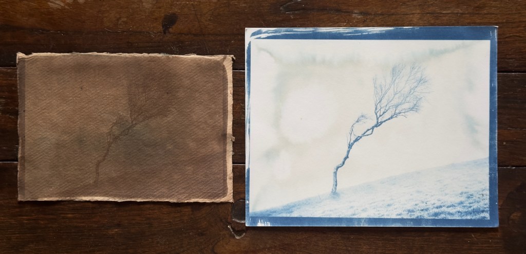
Some of these earlier tests I made were done at university using the consistency of the UV lightbox. I used basic cartridge paper which wasn’t always successful but in testing negative quality and exposure times it was better to use this rather than use too much of the higher quality paper.
Early tests and experiments, with some success:
You can see in the tests above that there are several errors – these are down to many different factors but the result often of inconsistency in my process.
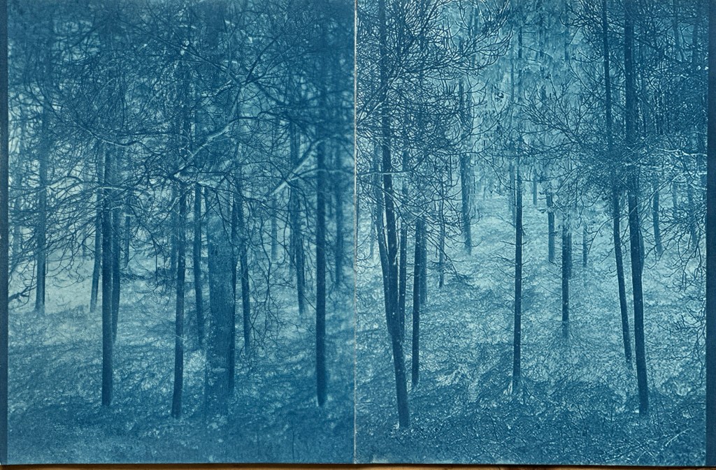
- In the collage (top middle) I had very different results in each print so when I tried to put them together the print looked ambiguous, this is also in part, down to my choice of negative.
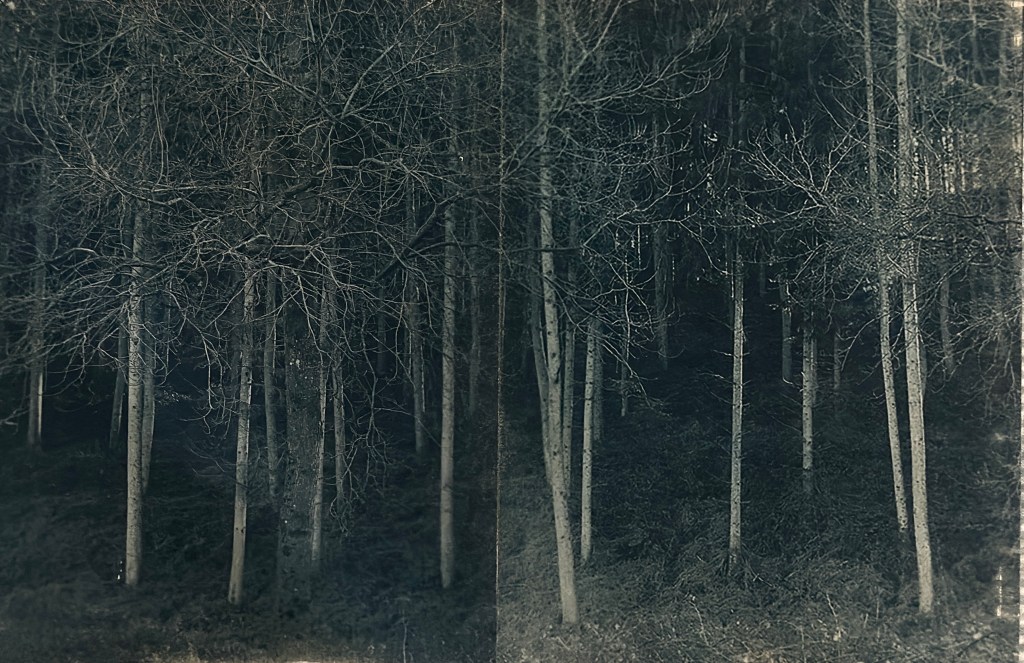
- For the first diptych (top left) it needed a better negative and longer wash. I also think I over exposed as the blues were very strong. I did use hydrogen peroxide in the wash which may have affected it too.
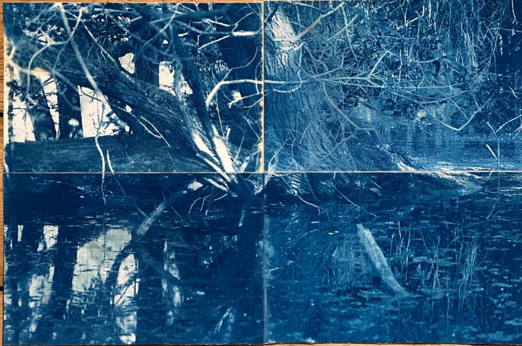
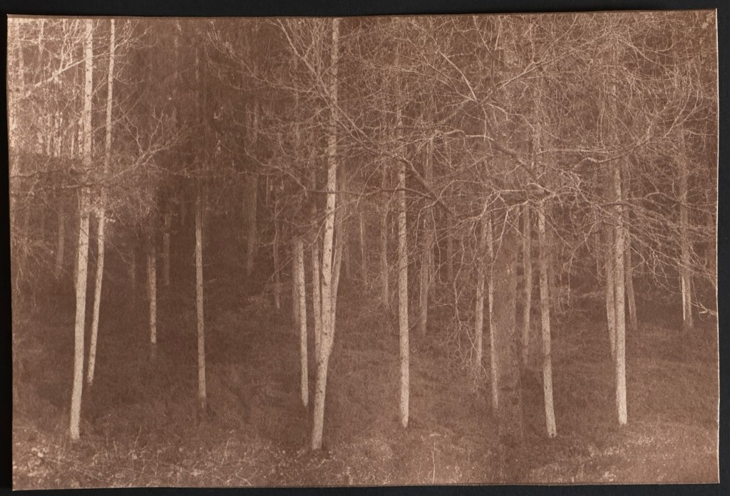
- in the third image – (top right) I initially had what I thought was a successful cyanotype print but having left it for 24 hours it had developed a brown/blue watermark. This could be down to lying it flat when wet and not quite rinsing properly. The other image was a test for bleaching and toning, I deliberately used a failed cyanotype to try this out (failed due to too much blue left on the print) and you can see how it has stained it too deeply. I had left it in the bleach for several hours but this didn’t remove all the blue.
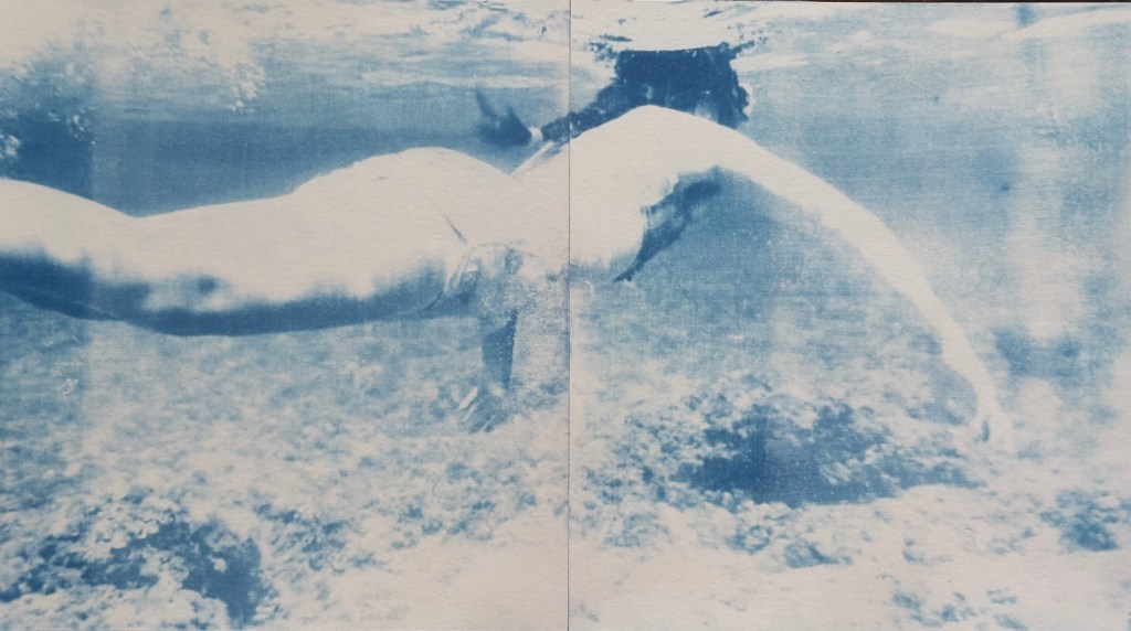
- In the diptych print (bottom) I took a screenshot from an underwater video that I took last summer when in Menorca. I like the effect of the water in cyanotypes, although the print itself needs more refinement I think this does demonstrate its versatility.
Refining my process:
Below are the images and digital negatives I chose to continue this process with:
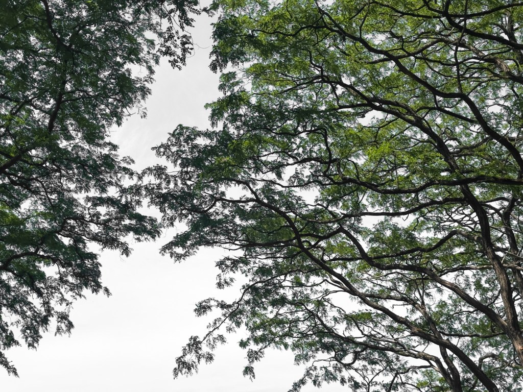
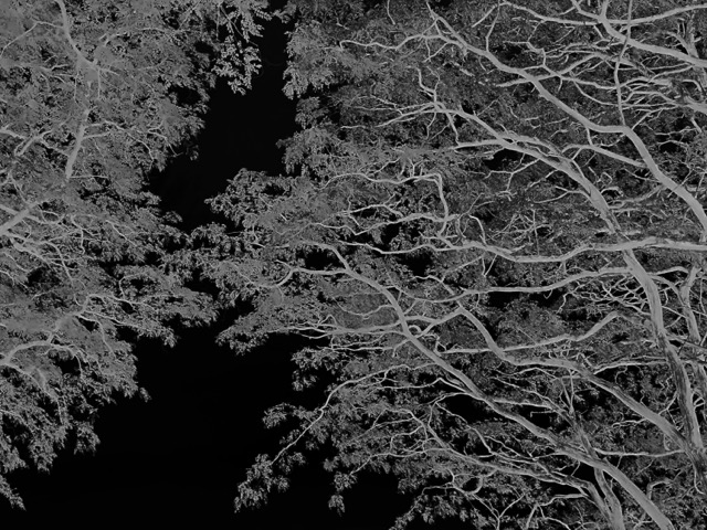
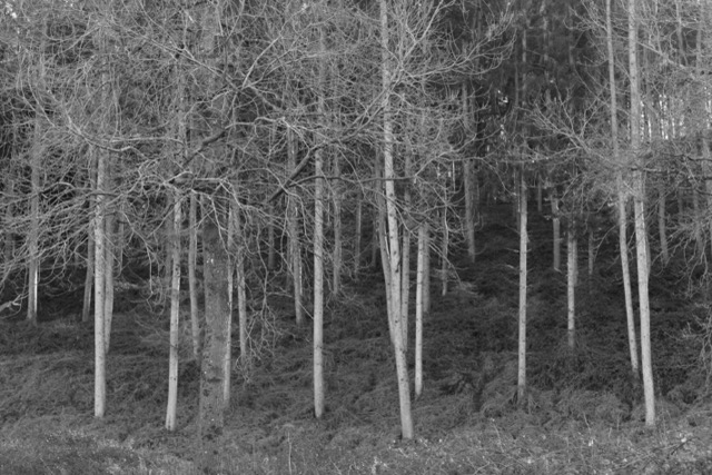

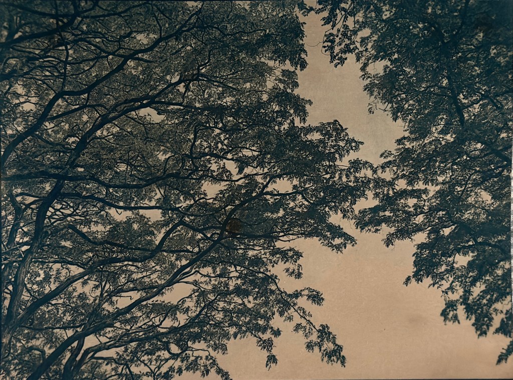
Both of the photographs are of key places and moments aligned with my theme. Ashton Woods is next to my home, I see this view several times a week and it has been the subject of some controversy recently with a new landowner closing off access to it. As a result, I co ordinated a local effort to have the area added to the definitive footpaths list. Sadly it will take years to reach a conclusion. In the shot with the canopy of the Acers, it was taken when I was sat in an ice bath, I had sat trying to catch my breath and used the canopy as a focus to regulate my breathing. Once relaxed and acclimatised, I wanted to record the scene.
Successes:
These are by far my favourite pieces. In the top image I exposed the cyanotype before toning in coffee grinds. I love the effect of this when I compare to the third image down, in which I had bleached for a period of time and then toned in strong tea. I enjoy both results but the first print has retained more detail and I particularly like the greyer blue effect.
For the second image down, I made a diptych, slicing the image in half and then exposed on two sheets of 10×8 rag paper, as before. I also soaked this in coffee grounds, it is a much deeper blue (as a result of a different exposure) and is darker overall. I like the tones here and darker shadows.
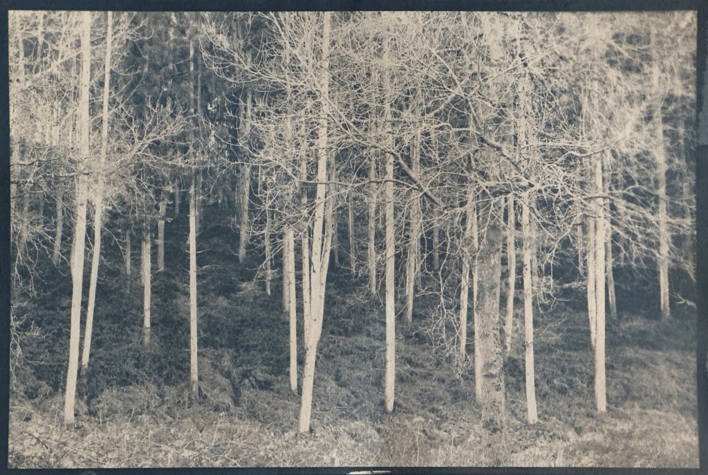
The final image is my favourite overall. I toned this in coffee also and the effect is exactly what I was after. I have been greatly inspired by the work of Albarran and Cabrera and this was my attempt at creating something along those lines. It is reminiscent of Japanese art. The Japanese practice of ‘Shinrin Yoku’ has gathered much attention in recent years, it is a form of relaxation that involves immersing oneself in nature. Its aims are to find peace and quiet in woodland spaces, absorbing the sights and sounds whilst breathing deeply. It is a mindful experience, which links in to the cold water immersion that I was practicing at the time. I did attempt a larger scale version, using the bleach and tone process, but it didn’t work very well in time for my submission. I lost too much detail unfortunately. I may attempt to use this once I have access to the larger printers at university in September.
