
Over the course of a couple of sessions at university, I’ve experimented with the above techniques to determine whether any might be something I would like to expand on for my FMP. As has been the case for much of this module, I am restricted by time due to course changes (I am taking two modules in parallel despite being on a part time study) so haven’t had the opportunity to be as experimental with this as I’d have liked. Additionally, I need to experiment mostly from home, as for the remaining few weeks of the module, facilities are not available at the University.
I think the important thing here will be in just understanding the process, how the results can be variable and whether it might be something that lends itself to a piece of my work. I mention this in other posts, following on from other practitioners examples, that having a book with mixed outputs could be interesting. Therefore, even a single piece could be very impactful.
Here are digital images of the first experiments, using methods above:
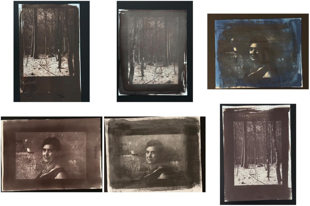
Several that I tried which aren’t here as I disposed of them, were failures due to the paper I’d chosen. I found that the gum bichromate came off easily in the wash and so left no image. I also noticed that several here have what appear to be blurred areas but I realised that this was because I’d forgotten to put the weight on the UV lid. Out of all the experiments, I found salt printing and Van Dyke (top left) to be the most successful. I like the richness of the Van Dyke process, the salt printing was similar to cyanotype in that it seemed to be quite forgiving, I think it also gave higher contrast (bottom right)
Gum Bichromate
I tried the Gum Bichromate process at home. With it being late Spring and with plenty of sunshine around, I was able to expose outside and enjoy the process of understanding how conditions can effect results and how to work with them. The intermittent cloud meant keeping a close eye on progress.
I used a dark green watercolour paint and mixed with gum arabic and potassium dichromate. I made a total of 30mls of solution and added 2.4g of pigment (dark watercolour, more green than black)
I applied the mix to the Hanhemuhle platinum rag (for the best consistency and to withstand the wash) and after application with the wet brush I used a large dry brush to try and blend the strokes. I don’t think I had the best brushes for this but nonetheless I like the added texture of brushstrokes. Once dry, I placed the paper and negative inside a picture frame and was careful to make sure there were no gaps underneath, to avoid any blurred sections.
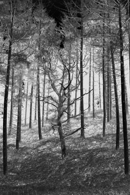
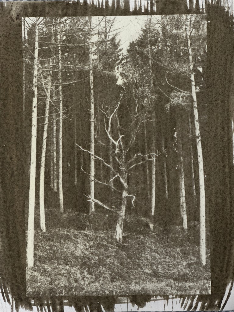
Negative used:
I tried 4 in total, using the same negative so that I could compare. I varied exposure slightly according to conditions as follows:
- print 1 – 3.5 minutes
- print 2 – 5 minutes
- print 3 – 2 minutes
- print 4 – 3 minutes
Then I gave a gentle brief rinse to remove any excess chemical to avoid orange marks in the wash, I left the images face down for 15 minutes before changing the water and leaving for another 15.
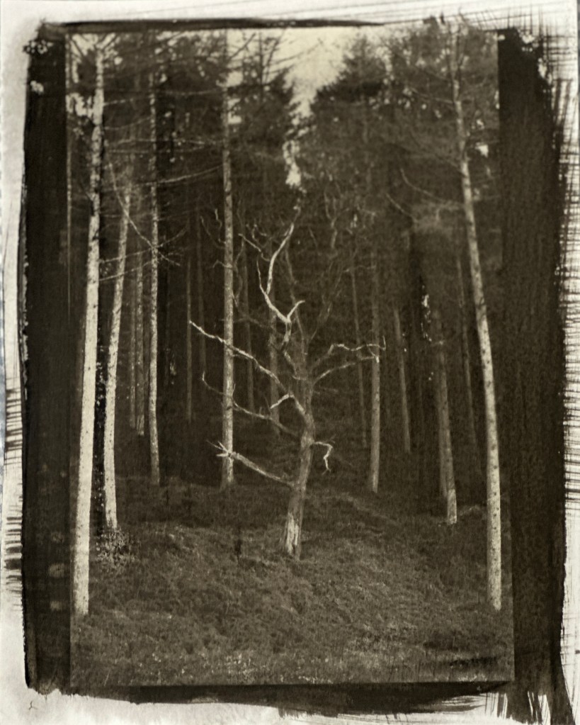
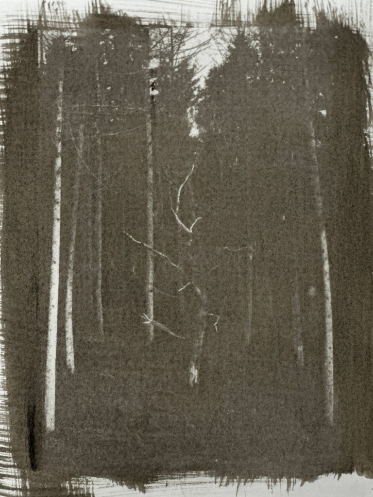
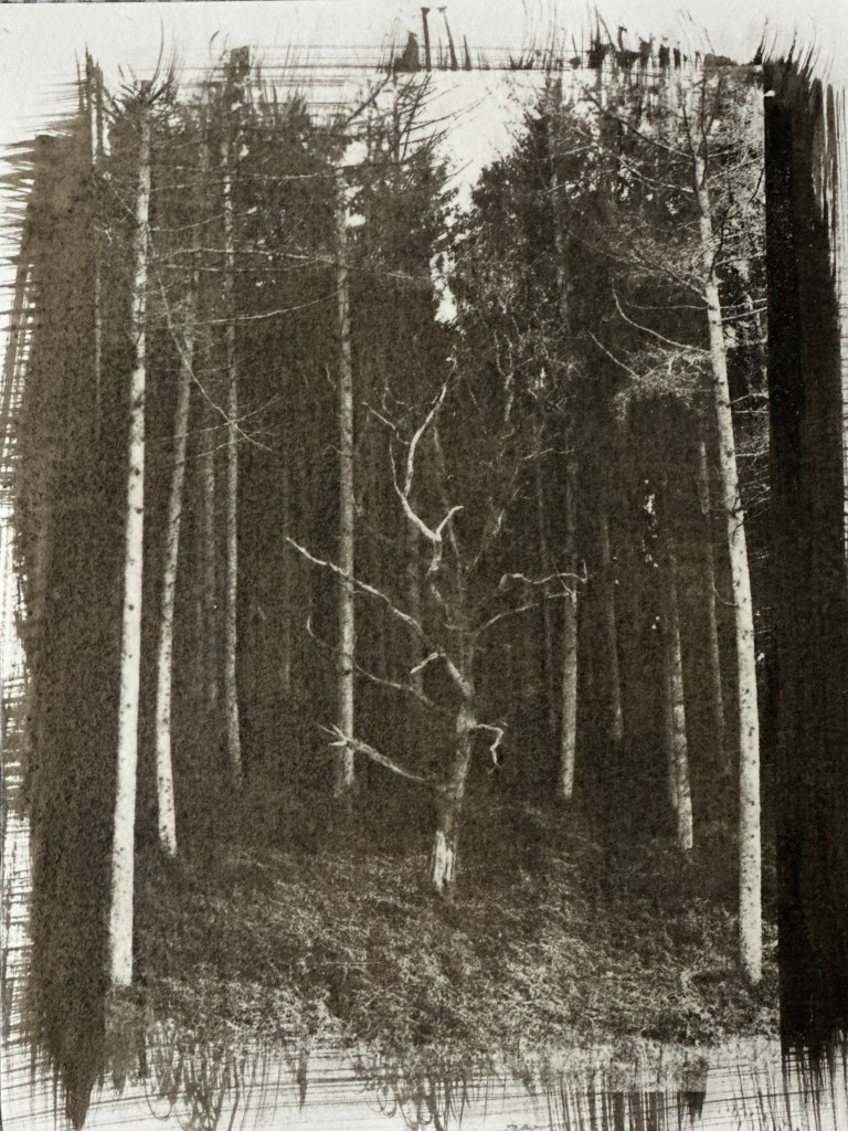
On Print 2 (top right) I lost the details in the image because of overexposure I suspect, however I also noticed some inconsistency in the solution application because it seemed much lighter than the first image. The first one (top left) I think is the most successful as I think it benefited from a higher concentration of pigmented solution, I think I picked up more of the ink on the brush and therefore I need to be more careful with mixing – I did this all under a safe light which made it harder to see! 3 minutes seems to be ample time for exposure on a late Spring day. For the remaining prints, they were also slightly lighter and after the wash process I used a fine soft brush to lightly go over the highlights to remove any chemical that hadn’t quite loosened off and this worked well. On print 4 (bottom right) you can see uneven distribution of the chemical as it is much darker on the right side.
I really enjoyed this process. It was hugely satisfying to experiment with and I think it is more forgiving than cyanotype with a digital negative, it seems to pick up more detail in the shadows whereas I find cyanotype can look a bit flat. I am pleased that I managed to improve on results after my initial experiments which were less successful. I will be using this again for my FMP as part of my intended book.
It is frustrating not to push all of these methods further for this module. I have had to work within the timeframe and also as I am gradually building facilities at home, I have a fairly crude process, not to mention I don’t have access to some of the facilities that may make this more streamlined! I do like that I am creating a sustainable environment to work within as I won’t have university facilities beyond the course. I hope that this demonstrates a commitment to my journey beyond.
